
Rugby Analytics: Creating a rugby pitch in R
This tutorial explains how to create a Rugby Union pitch in R using ggplot.


I'd like to use data to get to know more about rugby and create some cool visualisations like the ones we see for football. However, I haven't seen too much info about, not many visualisations like heatmaps, shot maps, etc. either. And so, I thought I would have a crack at it.
Let's start from the basics and see how we can create a Rugby Union pitch in R using ggplot. This post by @WitnesstheAnalysis was of great inspiration so check it out.
👀High-level strategy
For each half of the pitch, we would need to plot the following lines:
- Vertical solid lines for the goal line, 22-metre and halfway line
- Vertical dashed lines for the 5-metre line from the goal and the 10-metre line
- Horizontal dashed lines at 5 and 15 metres, parallel to the touchline
- Vertical lines for the goalposts
Once we've defined the correct data frame (DF) to reflect the above, we can easily plot all the lines above using ggplot.
🗄️Data definition
Let's start with the vertical lines. In general, to draw a line with ggplot, we need four parameters: x,y coordinates of the starting point and x,y coordinates of the ending point of the segment.
For example, imaging that the goal area goes from x=0 to x=20, for the goal line, we would need to set the following parameters:
- x = 20
- y = 0
- xend = 20
- yend = 70
The above will create a 70-metre high vertical line at x = 20. The same logic applies to the 22-metre line and the halfway line for both halves of the pitch.
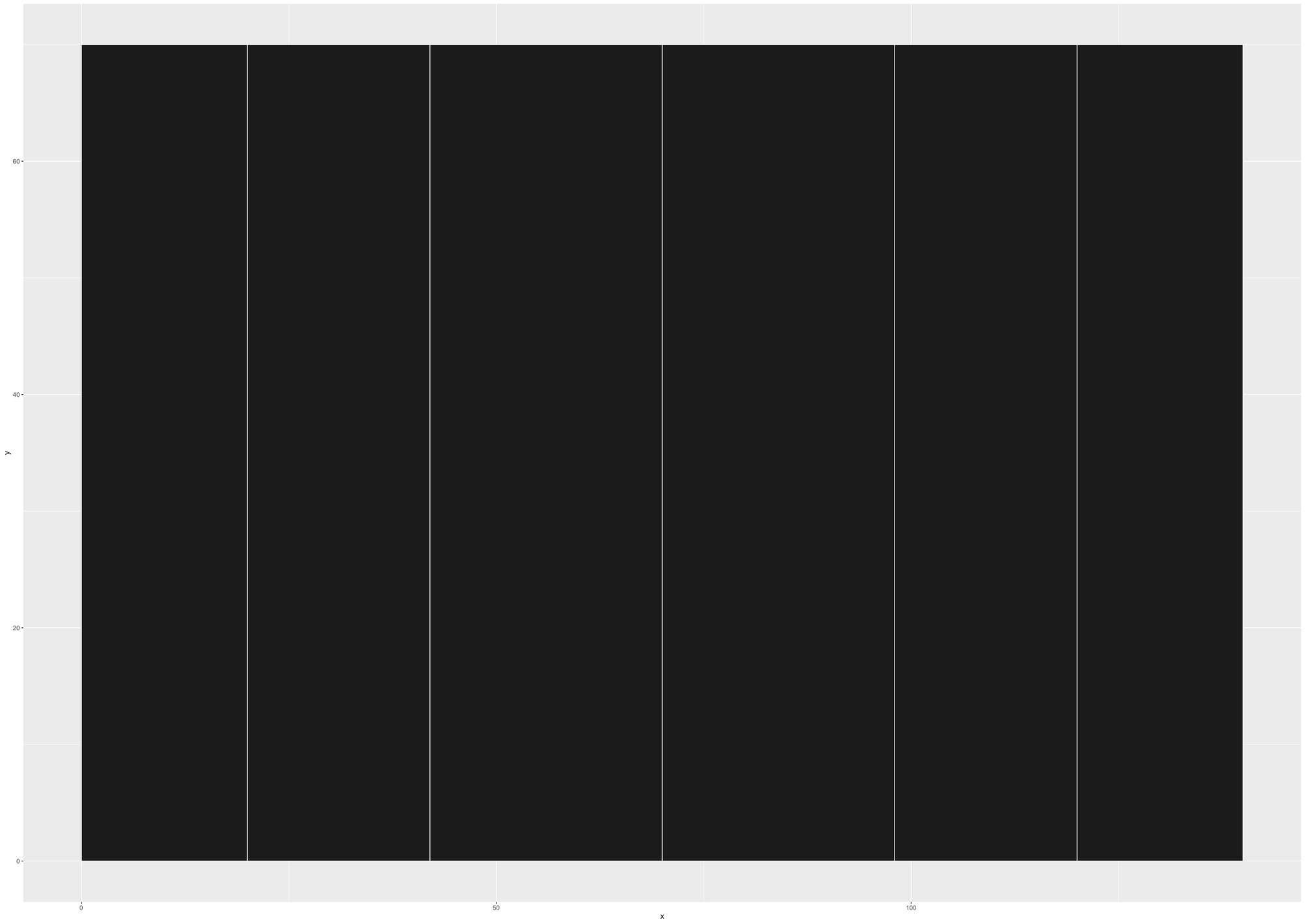
Putting all together, for the solid vertical lines, we can create a data frame containing the data below:
lines <- data.frame (x = c (20,42,70,98,120),
                     y = c (0,0,0,0,0),
                     xend = c(20,42,70,98,120),
                     yend = c(70,70,70,70,70))
The above will produce the vertical lines we need:
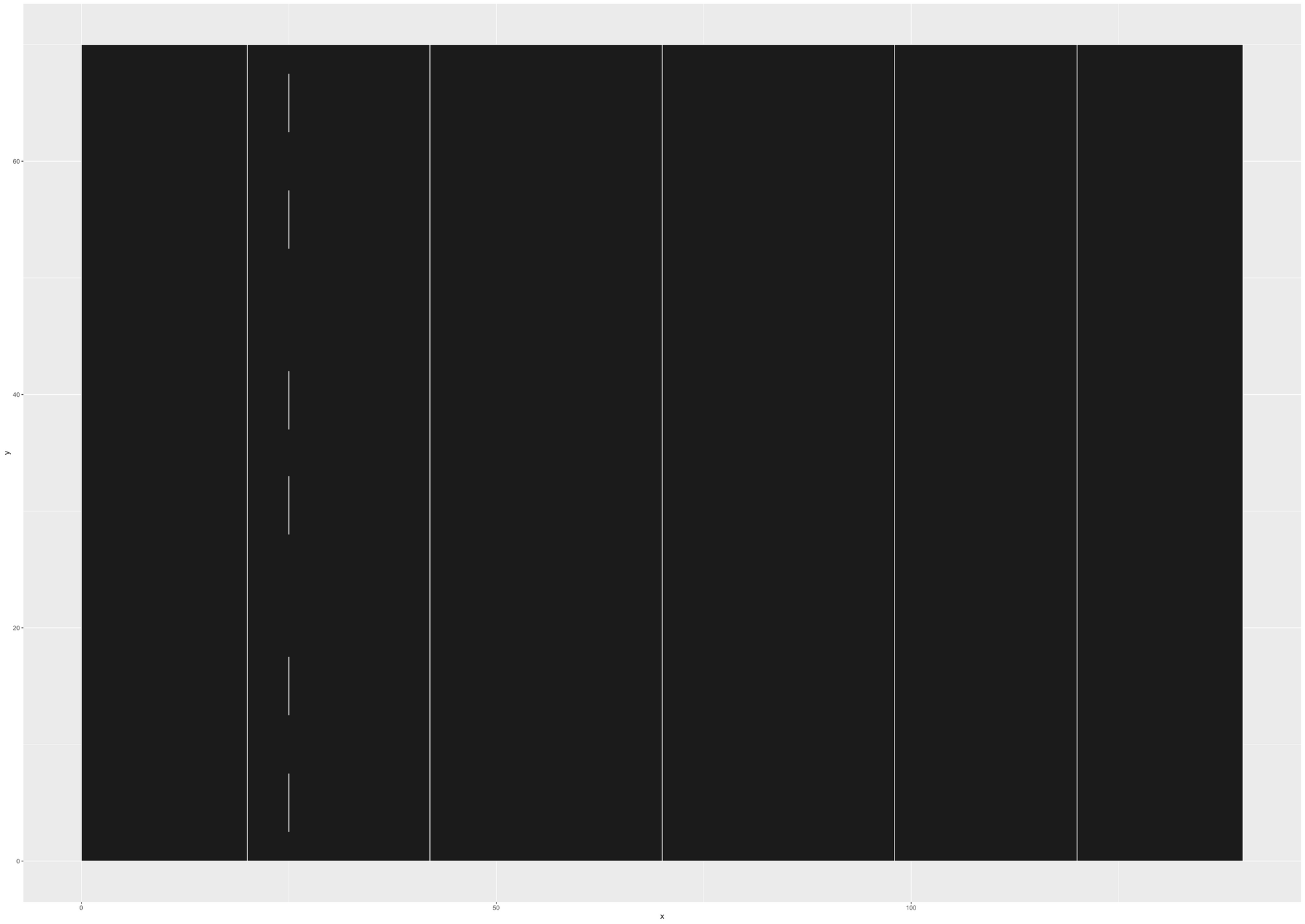
Similarly, we can add segments of the line to plot the 5m, which corresponds to x = 25 in our plot, which runs parallel to the goal line.
The DF will become the following one
lines <- data.frame (x = c (20,42,70,98,120,
                            25,25,25,25,25,25),
                     y = c (0,0,0,0,0,
                            2.5,12.5,28,37,52.5,62.5),
                     xend = c(20,42,70,98,120,
                              25,25,25,25,25,25),
                     yend = c(70,70,70,70,70,
                              7.5,17.5,33,42,57.5,67.5))
Which will produce the plot below:
Similarly, we can proceed in the same way and add the 10-metre line. Then, mirror everything for the other half of the pitch to get the following plot:

Next, we need to plot two sets of horizontal lines, for each half of the pitch, for the 5-metre and 15-metre lines. This time, y will be fixed, and x and xend will vary.
Let's edit our DF to include a 5-metre line parallel to the touchline (y = 5):
lines <- data.frame (x = c (20,42,70,98,120,
                            25,25,25,25,25,25,
                            60,60,60,60,60,60,60,
                            80,80,80,80,80,80,80,
                            115,115,115,115,115,115,
                            25,39,57,67,77,95,110),
                     y = c (0,0,0,0,0,
                            2.5,12.5,28,37,52.5,62.5,
                            2.5,12.5,22.5,32.5,42.5,52.5,62.5,
                            2.5,12.5,22.5,32.5,42.5,52.5,62.5,
                            2.5,12.5,28,37,52.5,62.5,
                            5,5,5,5,5,5,5),
                     xend = c(20,42,70,98,120,
                              25,25,25,25,25,25,
                              60,60,60,60,60,60,60,
                              80,80,80,80,80,80,80,
                              115,115,115,115,115,115,
                              30,45,63,73,83,101,115),
                     yend = c(70,70,70,70,70,
                              7.5,17.5,33,42,57.5,67.5,
                              7.5,17.5,27.5,37.5,47.5,57.5,67.5,
                              7.5,17.5,27.5,37.5,47.5,57.5,67.5,
                              7.5,17.5,33,42,57.5,67.5,
                              5,5,5,5,5,5,5))
The DF above will produce the following pitch:

In the same way, we can plot the 15-metre line, and the two horizontal lines for the upper half of the pitch:

We're almost with the data definition. The DF named lines will be our main data structure containing all the lines of the pitch. We then need to define colours for the background, text and goalposts.
Also, we need to set the maximum and minimum size of the pitch. In our case, the pitch would be 140m wide:
- 0-20: in-goal area
- 20-42: goal line to 22m line
- 42-70: 22m line to halfway line
- 70-98: halfway line to 22m line
- 98-120: 22m line to goal line
- 120-140: in-goal area
And 70m high:
- 0-5: touchline to the 5-metre line
- 5-15: 5-metre line to 15-metre line
- 15-55: 15m line to opposite 15m line
- 55-65: 15m line to 5m line
- 65-70: 5m line to the touchline
At last, we define the parameters to add the 5-metre wide goal posts for each side of the pitch.
#Colours definition
line_colour <- "#fcfcfc"
background_colour <- "#1c1c1c"
goal_l_colour <- "white"
goal_r_colour <- "red"
text_colour <- "#fcfcfc"

#Pitch boundaries
ymin <- 0 #Min width
ymax <- 70 #Max width
xmin <- 0 #Min length
xmax <- 140 #Max length

#Goal Posts
x_goal_l <- 20 #Left goal
x_goal_r <- 120 #Right goal
y_goal_b <- 32.5 #Bottom y coord
y_goal_t <- 37.5 #Top y coord
📊Plot creation
Taking into account the Data Frame and variables detailed above, we can proceed with the plot creation using ggplot.
Firstly, using geom_rect we plot a 140x70 rectangle:
ru_pitch <- ggplot() + xlim(c(xmin,xmax)) + ylim(c(ymin,ymax)) +
  geom_rect(aes(xmin=xmin, xmax=xmax, ymin=ymin, ymax=ymax), fill = background_colour, colour = line_colour)
This will draw the base of our plot, which will be the playing area of the pitch. By running the code above, we will obtain the following plot:

Next is where the magic happens. Let's use geom_segment to plot all the lines explained earlier and contained in lines:
ru_pitch <- ggplot() + xlim(c(xmin,xmax)) + ylim(c(ymin,ymax)) +
  geom_rect(aes(xmin=xmin, xmax=xmax, ymin=ymin, ymax=ymax), fill = background_colour, colour = line_colour) +
  geom_segment(data = lines, aes(x = x, y = y, xend = xend, yend = yend), colour = line_colour,size = 0.5)
Then, run the plot again, and this is what you'll get:

In the last step, we add another 5-metre high segment in correspondence with the goal line for the goalposts of each team. I colour coded them differently to highlight the direction of play of the two sides.
#Create the plot
ru_pitch <- ggplot() + xlim(c(xmin,xmax)) + ylim(c(ymin,ymax)) +
  geom_rect(aes(xmin=xmin, xmax=xmax, ymin=ymin, ymax=ymax), fill = background_colour, colour = line_colour) +
  geom_segment(data = lines, aes(x = x, y = y, xend = xend, yend = yend), colour = line_colour,size = 0.5) +

  geom_segment(aes(x = x_goal_l, y =  y_goal_b, xend = x_goal_l, yend = y_goal_t),colour = goal_l_colour, size = 1.5) +
  geom_segment(aes(x =x_goal_r, y =  y_goal_b, xend =x_goal_r, yend = y_goal_t),colour = goal_r_colour, size = 1.5) +
  pitch_theme()
Run the plot one more time, and you'll get the final version of the pitch with all the lines and the two goals:
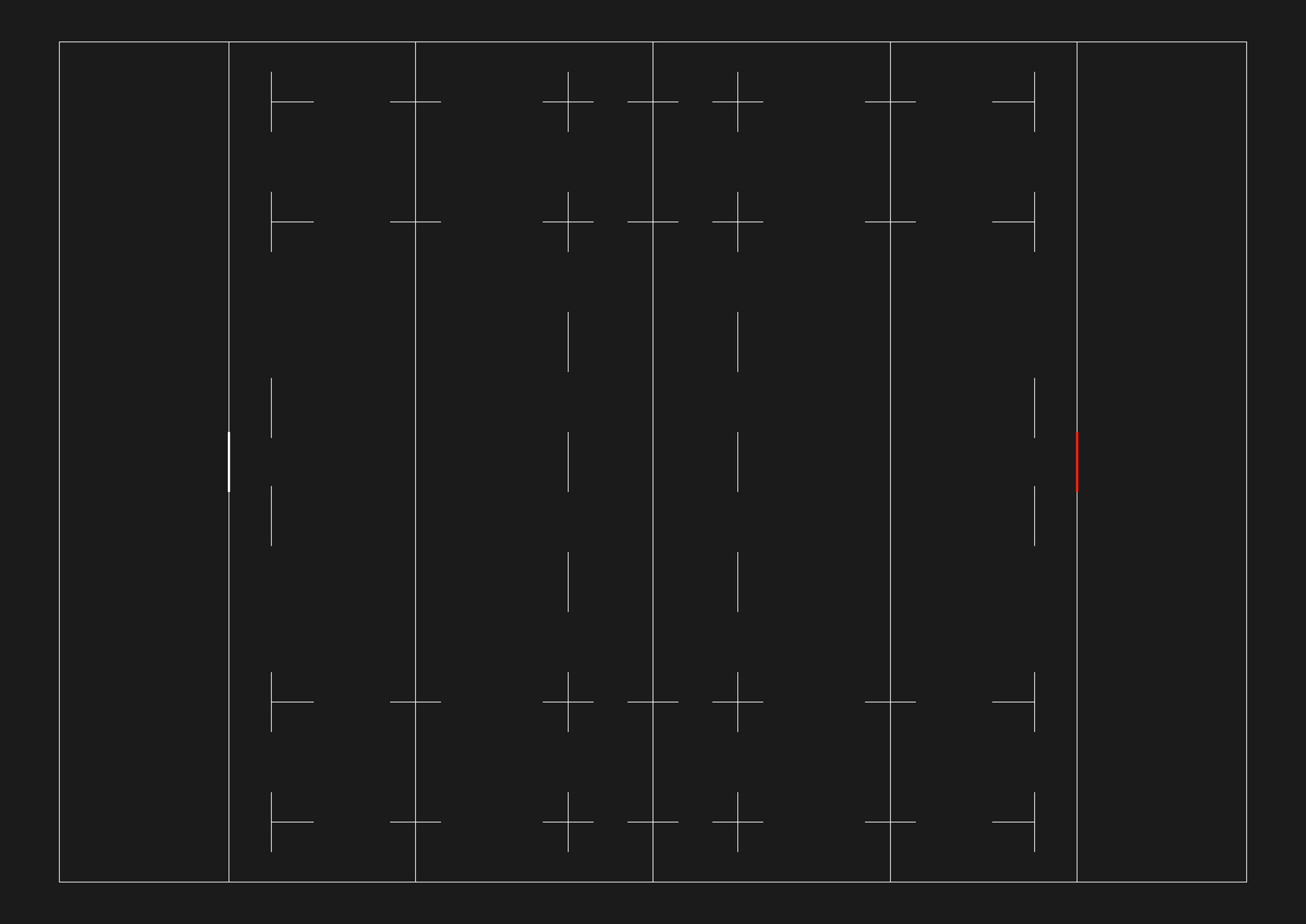
Ta-da! 🎉 I can already hear the trumpet sound and the crowd cheering. Now head to the bar, grab a pint, your go-to rugby scran and get ready to enjoy the game. In the next post(s), I will show you how to use data like rucks, lineouts, etc. to create scrum maps, ruck maps and other visualisations using the pitch we just created, so stay tuned!
If you've enjoyed this post, please share it on social media and follow me on Twitter @figianic for more of the same.
Below, you can find the full code. Feel free to tweak it as needed and reference this post in case you share something cool.