
Football Analytics: Creating an xG-xGA comparison chart in R
In this tutorial, I'm going to show you how to create a chart to compare xG and xGA metrics across multiple gameweeks for one or more football teams.

I was looking for a visualisation to track Expected Goals (xG) and Expected Goals Against (xGA) effectively and possibly compare these metrics between different teams and seasons. I couldn't find what I wanted so I created an R script to implement the plot I had in mind.
This tutorial shows you step-by-step how to create an xG-XGA comparison graph for one or more teams, and its progression across multiple games.
Let's dive in!
Data structure
You can easily retrieve xG and xGA figures for all the major leagues from FbRef. This time, I decided to avoid any manual step and I decided to use the WorldFootballR package to retrieve the data I needed. I highly recommend using it. You can install and load the package with the following commands:
# install.packages("devtools")
devtools::install_github("JaseZiv/worldfootballR")

library(worldfootballR)
This package contains a lot of different functions. For my use case, I focused on the following two:
- get_match_urls: allows you to retrieve the league and season you want to get events for
- get_match_summary: allows you to get key events (goals, penalties, substitutions, etc.) for every game of the league you selected
Let's start by retrieving all the events we need with the following two lines of code:
#EPL 2021/2022
epl_22_urls <- get_match_urls(country = "ENG", gender = "M", season_end_year = 2022, tier = "1st")
epl_22_stats <- get_match_summary(match_url=epl_22_urls)
Data manipulation
The command above gives you an incredible amount of valuable info. But also many fields that we don't need. We can use the following commands to have a consistent naming convention, using the janitor package, and retain only the fields that we need:
janitor::clean_names() %>%
select(match_date, matchweek, home_team, home_x_g, home_score, away_team, away_x_g, away_score, team, home_away)
Also, the data imported from FbRef is not in the way I need it. Starting from the available fields above, we can create all the additional fields that we need:
team_stats_summary$xG <- ifelse(team_stats_summary$team == team_stats_summary$home_team, team_stats_summary$home_x_g, team_stats_summary$away_x_g)

team_stats_summary$xGA <- ifelse(team_stats_summary$team == team_stats_summary$home_team, -team_stats_summary$away_x_g, -team_stats_summary$home_x_g)

team_stats_summary$result <- ifelse(team_stats_summary$team == team_stats_summary$home_team,
                                      ifelse(team_stats_summary$home_score > team_stats_summary$away_score,"W",
                                             ifelse(team_stats_summary$home_score < team_stats_summary$away_score,"L","D")),
                                      ifelse(team_stats_summary$home_score < team_stats_summary$away_score,"W",
                                             ifelse(team_stats_summary$home_score > team_stats_summary$away_score,"L","D")))

team_stats_summary$opponent <- ifelse(team_stats_summary$team == team_stats_summary$home_team,team_stats_summary$away_team, team_stats_summary$home_team)
After running the command above, you will have the following fields:
- xG: field containing the Expected Goals metric of the team we're considering
- xGA: contains the same metric against the team we are evaluating
- result: which contains W, D, L in case of a win, draw or loss
- opponent containing the name of the opponent team
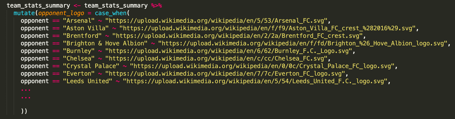
I'd also like to have logos of the opponent for each gameweek. For this reason, I created the opponent_logo field, with the following logic:
team_stats_summary <- team_stats_summary %>%
    mutate(opponent_logo = case_when(
      opponent == "Arsenal" ~ "https://upload.wikimedia.org/wikipedia/en/5/53/Arsenal_FC.svg",
      opponent == "Aston Villa" ~ "https://upload.wikimedia.org/wikipedia/en/f/f9/Aston_Villa_FC_crest_%282016%29.svg",
      opponent == "Brentford" ~ "https://upload.wikimedia.org/wikipedia/en/2/2a/Brentford_FC_crest.svg",
      ...
      ...
 opponent == "West Ham United" ~ "https://upload.wikimedia.org/wikipedia/en/c/c2/West_Ham_United_FC_logo.svg",
      opponent == "Wolverhampton Wanderers" ~ "https://upload.wikimedia.org/wikipedia/en/f/fc/Wolverhampton_Wanderers.svg",
      TRUE ~ "https://a.espncdn.com/combiner/i?img=/redesign/assets/img/icons/ESPN-icon-soccer.png&w=288&h=288&transparent=true"))
Logos for EPL 21/22, EPL 20/21 and Serie A 21/22 were added. Remember to add the logos manually in case you want to plot something different, like La Liga games or older EPL seasons.
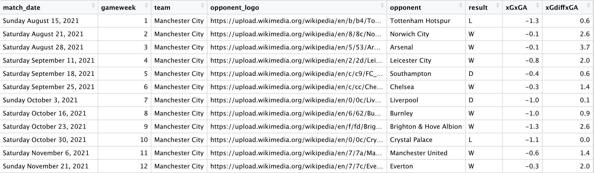
At this point, all the raw data we need is there. I'm using Manchester City 2021/2022 games as an example and here is the Data Frame so far:
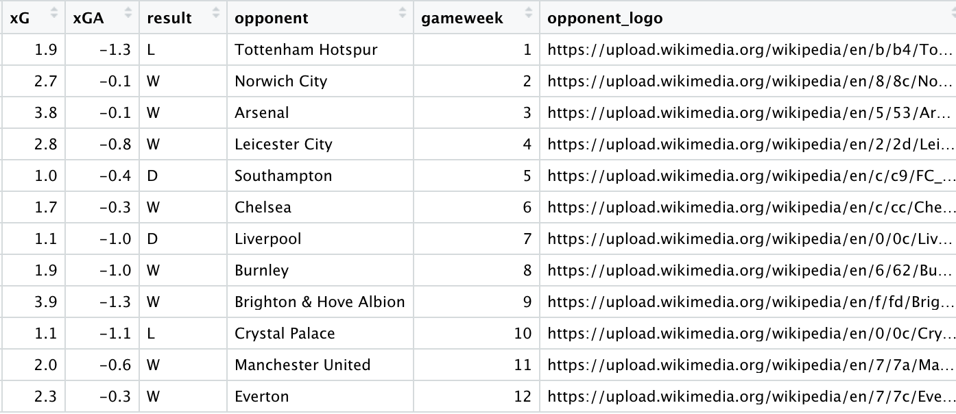
We just need to re-shape it accordingly to what we need. In particular, the core of the chart will be a bar chart graph with a positive bar (xG) and a negative bar (xGA) for each gameweek. We can obtain the two DFs by selecting different columns accordingly, thus creating team_xG and team_xGA.
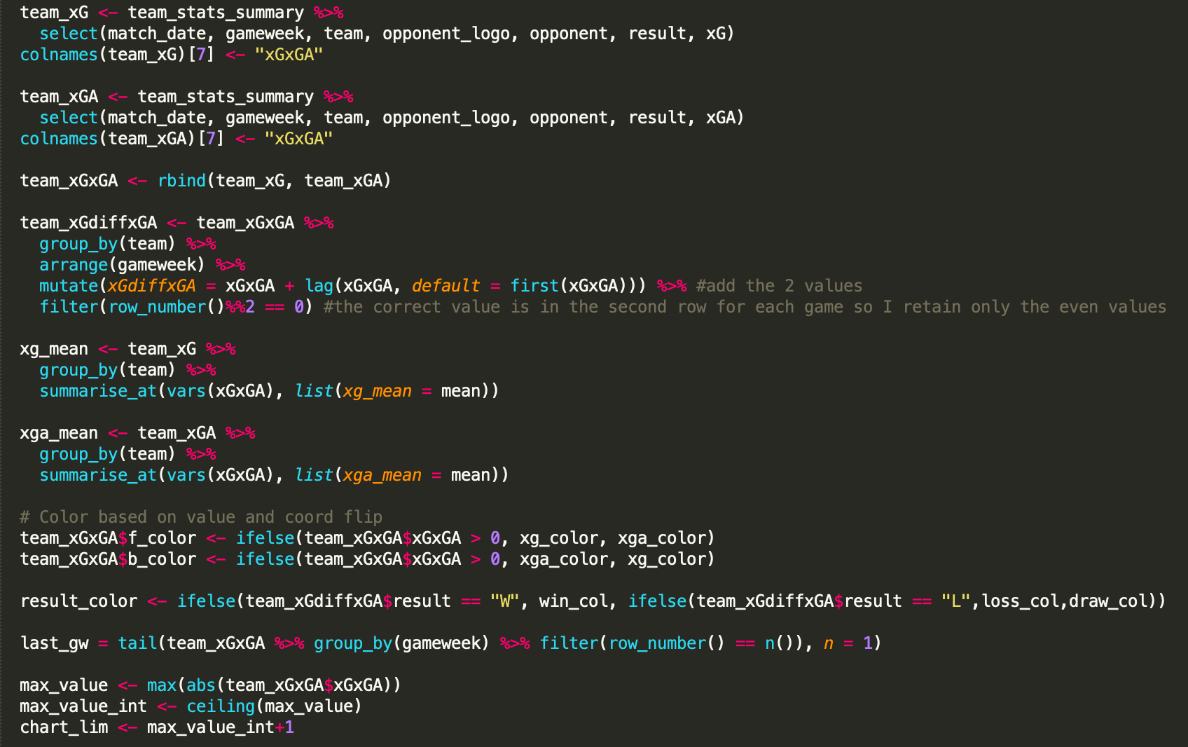
Also, we need to have xG and xGA for each gameweek in the same DF. For this, we need to rename the field containing the xG/xGA values to make sure they have the same name and. Then, the two must be then stitched together using the rbind function:
team_xG <- team_stats_summary %>%
    select(match_date, gameweek, team, opponent_logo, opponent, result, xG)
colnames(team_xG)[7] <- "xGxGA"

team_xGA <- team_stats_summary %>%
    select(match_date, gameweek, team, opponent_logo, opponent, result, xGA)
colnames(team_xGA)[7] <- "xGxGA"

team_xGxGA <- rbind(team_xG, team_xGA)
At this point, the DF named team_xGxGA should look like the following:
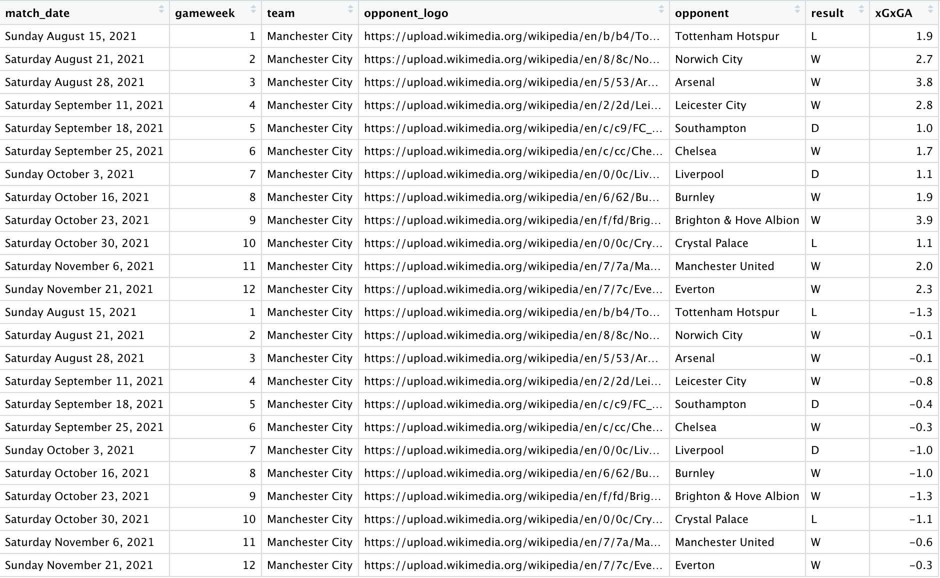
For each gameweek, you have two entries. One with the positive value of xG, and another one with the negative measure of xGA. And this is what we need to plot the bar charts, which will be the foundation of our plot.
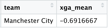
We can re-use the two DFs created above to compute mean values that we will use in the plot later:
  xg_mean <- team_xG %>%
    group_by(team) %>%
    summarise_at(vars(xGxGA), list(xg_mean = mean))

  xga_mean <- team_xGA %>%
    group_by(team) %>%
    summarise_at(vars(xGxGA), list(xga_mean = mean))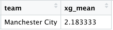
But that's not enough. I'd also like to have a graphical representation of the xG-xGA difference, like an xG plus/minus, and its progression. For this, we will use a different Data Frame.
By referring to the team_xGxGA DF above, we will need to create a new field that contains the difference between xG and xGA values for each gameweek. For example, for GW1 this metric will contain 1.9-1.3=0.6, for GW2 it will be 2.7-0.1=2.6, and so on. The following code will do the job:
team_xGdiffxGA <- team_xGxGA %>%
    group_by(team) %>%
    arrange(gameweek) %>%
    mutate(xGdiffxGA = xGxGA + lag(xGxGA, default = first(xGxGA))) %>%
    filter(row_number()%%2 == 0)
team_xGdiffxGA is the DF that contains the field named xGdiffxGA with the difference between the two metrics for each game.
Used Data Frames
A lot to take in. Here is a quick recap of the DF we will be dealing with:
- team_xGdiffxGA: contains events to plot xG-xGA difference and its progression across multiple games
- team_xGxGA: contains data for the bar charts, a positive one for xG and a negative one for xGA, for each match
- xg_mean and xga_mean: they contain mean values of xG and xGA
Plot creation
It's time to plot now. Let's focus on one team, again Manchester City, and start from the bar charts:
ggplot(data = team_xGdiffxGA, aes(x = gameweek, y = -chart_lim)) +
      geom_bar(data = team_xGxGA, aes(x = gameweek, y = xGxGA), fill = team_xGxGA$f_color, color = team_xGxGA$b_color,
               size = 0, stat = "identity", show.legend = FALSE)
Running the commands above will render the foundation of our plot:
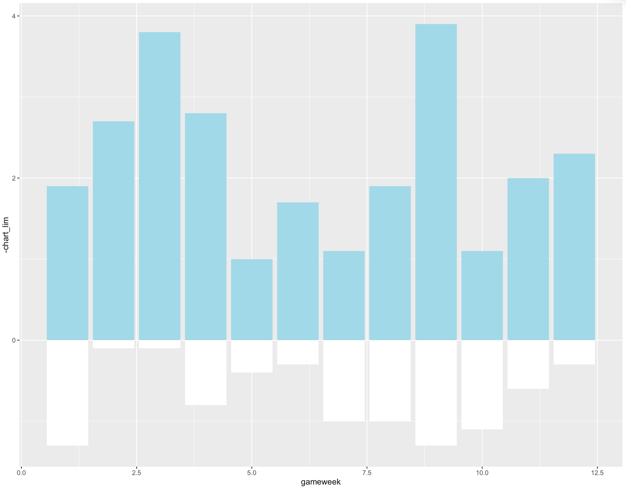
Where the colours are defined as:
  team_xGxGA$f_color <- ifelse(team_xGxGA$xGxGA > 0, xg_color, xga_color)
  team_xGxGA$b_color <- ifelse(team_xGxGA$xGxGA > 0, xga_color, xg_color)
For the fill and border colours respectively.
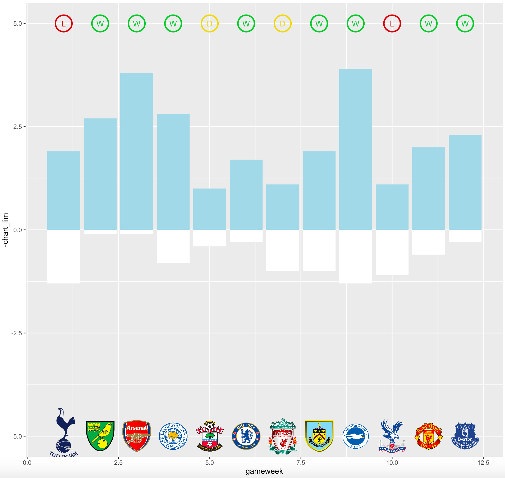
To add opponent logos for each gameweek, we need to add dummy points at the bottom of the chart (y=-chart_lim) for each gameweek. Size = 0.1 and color = color_background help to make sure these points won't be visible. Instead, we will use geom_image to visualise team logos for the teams that Man City have faced at each matchweek.
geom_point(data = team_xGdiffxGA, aes(x = gameweek, y = -chart_lim),
                 color = color_background, show.legend = FALSE,
                 shape = 21, stroke = 0.1, size = 0.1) +
ggimage::geom_image(data = team_xGdiffxGA, aes(image=opponent_logo), size = 0.06)) + scale_size_identity()
The code above provides the following plot:
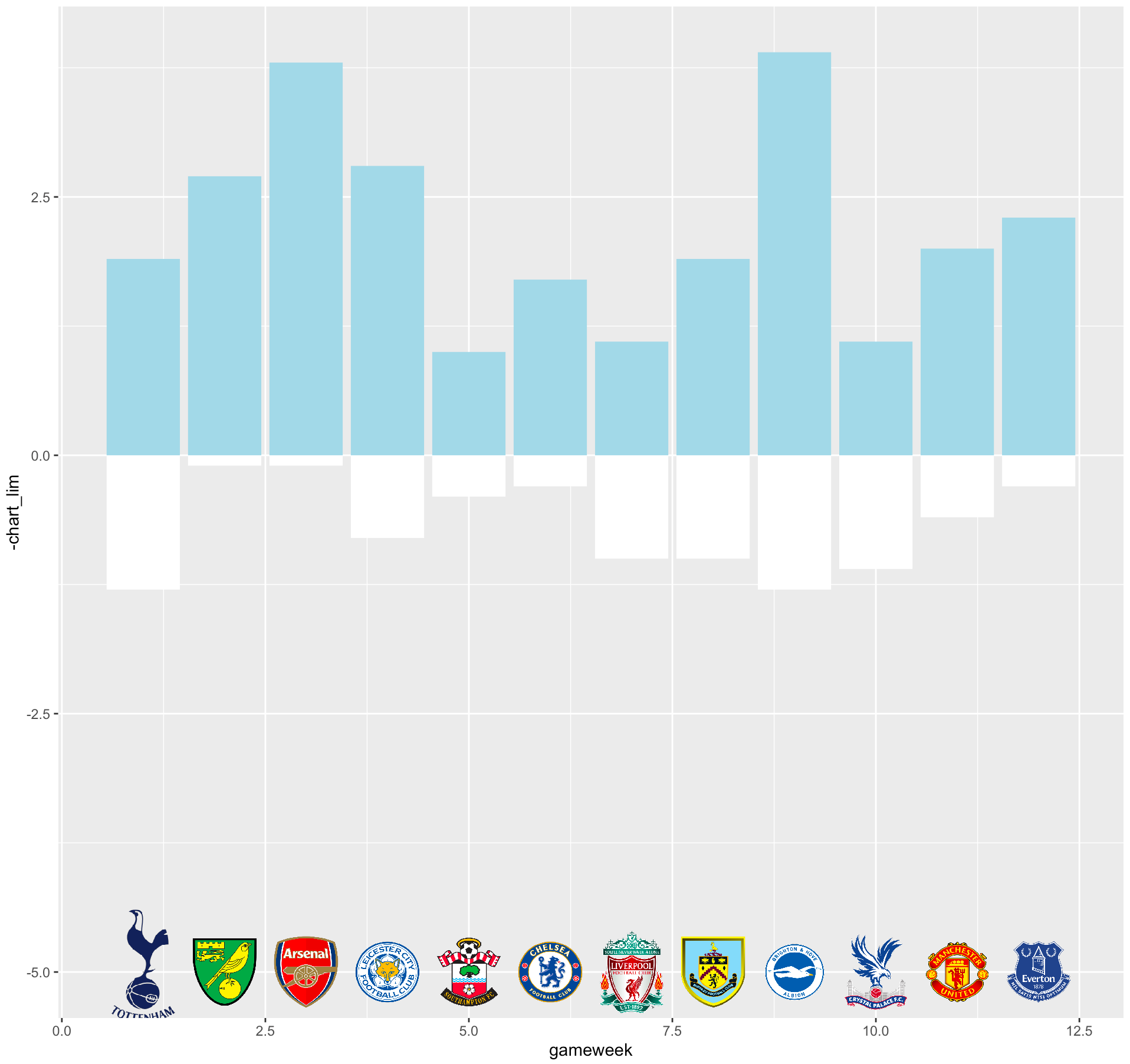
Brilliant, our chart is taking form. Let's add another step. It would be good to have the result of each game in correspondence with each bar. This would provide insights regarding how xG-xGA performance affects the final result.
This can be easily achieved by using geom_point to create a circle and geom_test to display the result in an abbreviated form like W, D, L. The two objects are also colour-coded accordingly to the result:
geom_point(data = team_xGdiffxGA, aes(x = gameweek, y = chart_lim),
                 color = result_color, show.legend = FALSE,
                 shape = 21, stroke = 1.5, size = 10) +
geom_text(data =team_xGdiffxGA, aes(x = gameweek, y = chart_lim, label = result), size = 4, color=result_color)
Where the colour is computed like:
result_color <- ifelse(team_xGdiffxGA$result == "W", win_col, ifelse(team_xGdiffxGA$result == "L",loss_col,draw_col))Running the code above will lead to the following plot:
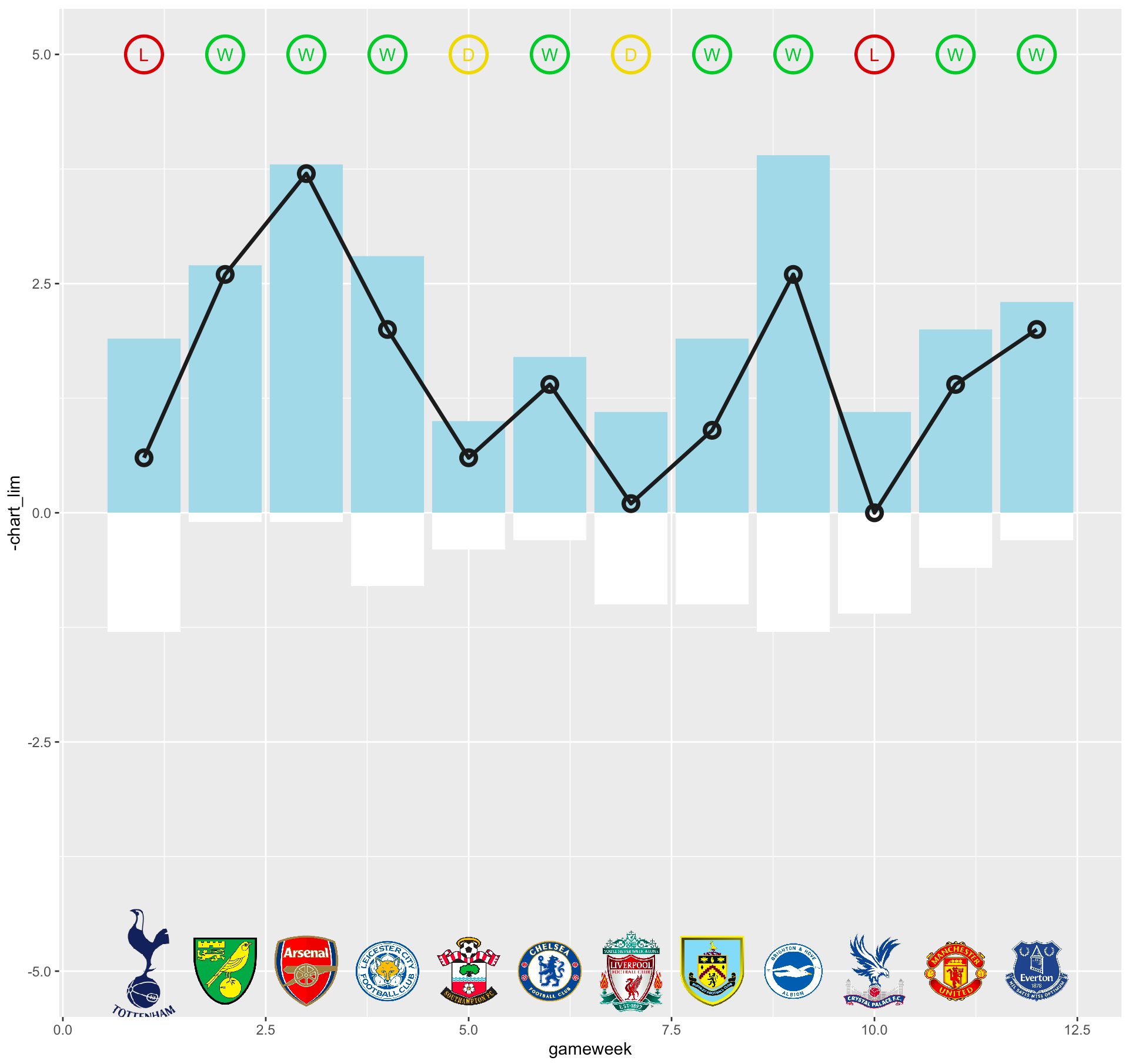
We can go one step further and create a line that shows the progression of the xG-xGA difference. For each gameweek, a point is plotted at y = xGdiffxGA. This field contains the difference between the two metrics. This is useful to provide a sort of xG plus/minus for each game.
geom_point(data = team_xGdiffxGA, aes(x = gameweek, y = xGdiffxGA),
                 color = color_background, show.legend = FALSE,
                 shape = 21, stroke = 2, size = 3) +
geom_line(data = team_xGdiffxGA, aes(x = gameweek, y = xGdiffxGA),
                size = 1.2, color = color_background)
Let's run the commands above to get the following plot:
We have the main plot now. Next, we can add y axis intercepts to display the average value for both xG and xGA:
geom_hline(data = xg_mean, aes(yintercept = as.numeric(round(xg_mean,2))), color = color_text, linetype='dotted') +
geom_hline(data = xga_mean, aes(yintercept = as.numeric(round(xga_mean,2))), color = color_text, linetype='dotted')
And add labels for xG and xGA values for each game. I'm using geom_label_repel, which is available in the ggrepel package because it seems to work better than geom_text and geom_label:
ggrepel::geom_label_repel(data = team_xGxGA %>% filter(xGxGA >= 0), aes(x = gameweek, y = xGxGA, label = xGxGA), nudge_y = 0.2, nudge_x = 0, size = 4,  min.segment.length = 10, color=color_text, fill=color_background) +
ggrepel::geom_label_repel(data = team_xGxGA %>% filter(xGxGA < 0), aes(x = gameweek, y = xGxGA, label = abs(xGxGA)), nudge_y = -0.2, nudge_x = 0, size = 4,  min.segment.length = 10, color=color_text, fill=color_background)
Then, we just need to better format the size of the entire plot and the axis intervals. In particular:
- chart_lim contains the max y value rounded to the closest integer number and sets the height of the plot
- A tick is created for each gameweek on the x axis
- On the y axis, ticks and labels are created only for the two mean values
coord_cartesian(ylim = c(-chart_lim, chart_lim)) + scale_x_continuous(breaks = 1:as.numeric(last_gw$gameweek)) + scale_y_continuous(breaks = c(as.numeric(round(xga_mean$xga_mean,2)),as.numeric(round(xg_mean$xg_mean,2))))Where the above parameters are computed as follows:
last_gw = tail(team_xGxGA %>% group_by(gameweek) %>% filter(row_number() == n()), n = 1)

max_value <- max(abs(team_xGxGA$xGxGA))
max_value_int <- ceiling(max_value)
chart_lim <- max_value_int+1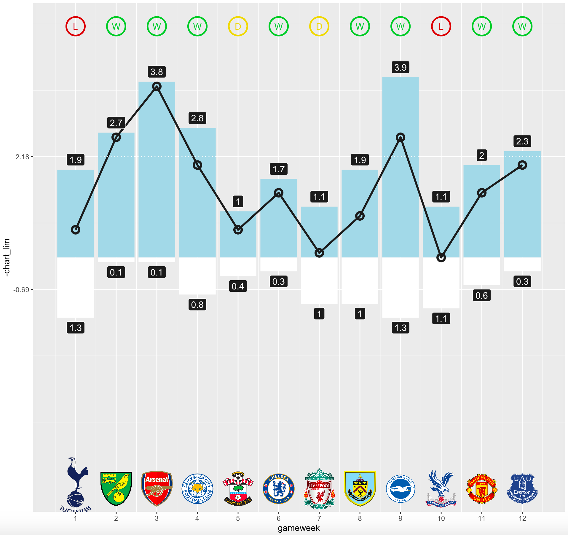
Almost done. All the info we need is there, we just need to add a title, make it darker and change the style. Let's put everything together and here it is:
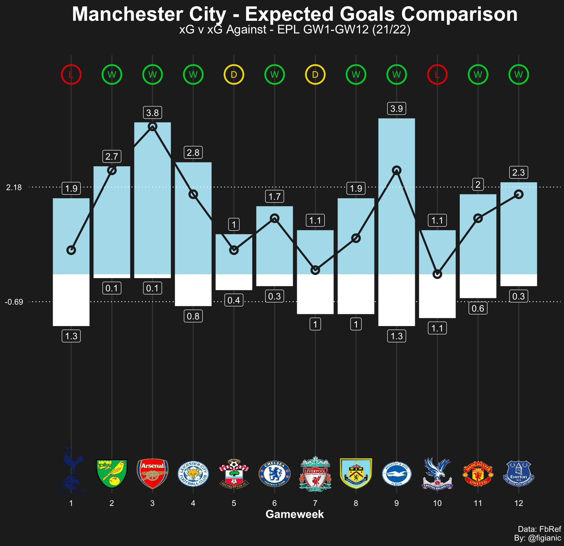
That's what I'm talking about! A thing of absolute beauty. Time to celebrate!
Additional insights and examples
I like the final result. There is so much valuable information in one single chart. Man City xG-xGA comparison is very interesting. In fact, from the plot above we can appreciate:
- Despite the result, their xG-xGA difference is always positive. Even when they didn't win, Man City outscored their opponents in terms of offensive performance
- The only exceptions are the draw against Liverpool where xG (1.1) and xGA (1) metrics are very close, and the loss against Crystal Palace where the xG-xGA difference was the lowest registered so far (0)
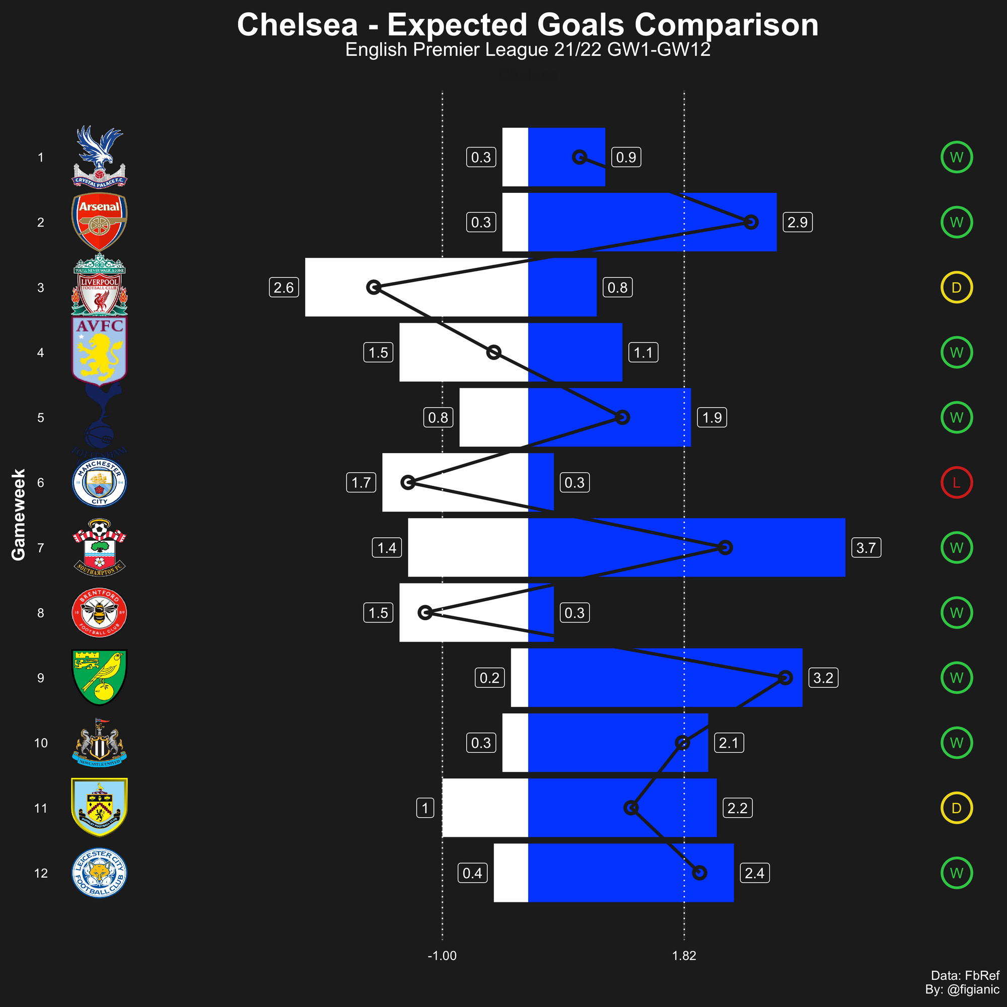
The same plot can be visualised vertically. No specific benefits, just a different way to present the data.
Let's take Chelsea as an example. On four occasions, their xG against was greater than the xG in their favour. They only lost one of those games, against Man City. This remarks their incredible defensive discipline. Even when they would deserve to lose, they take all three points (or draw as in the unlucky match against Liverpool where they played the entire second half one man down).
I used the same script to identify what's going on at Leeds United. They're in the relegation zone and seem to struggle more than the previous season after they got promoted. I plotted the chart on the first 12 games for both 20/21 and 21/22 seasons.
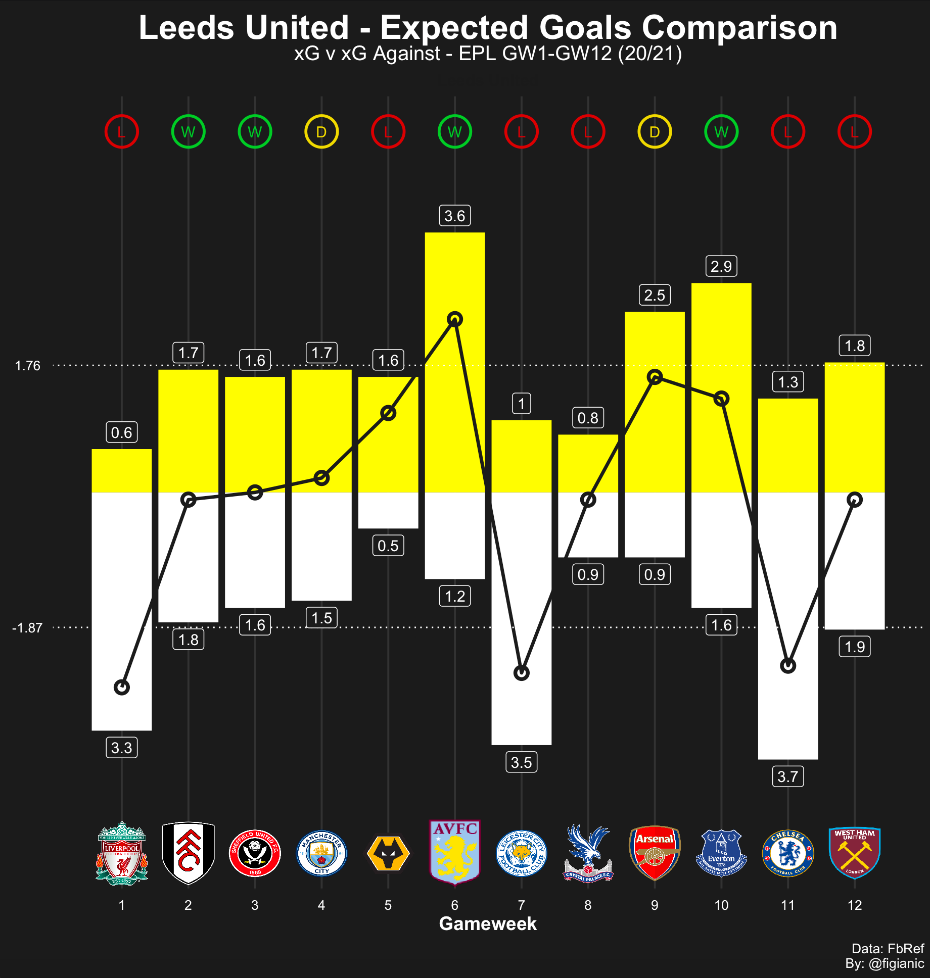
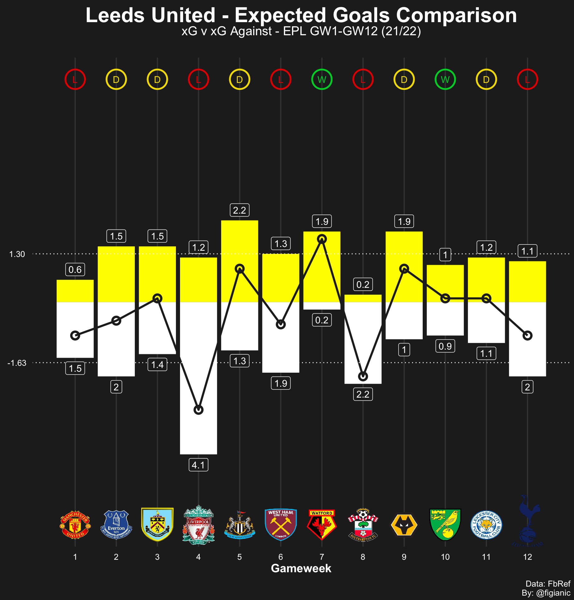
By focusing on the line tracking the xG-xGA difference, we can notice that only on three occasions the xG +/- was very negative last season: against Liverpool, Leicester City and Chelsea. On the other hand, in the current season, in at least 5-6 games, the xGA was far greater than the xG.
Also, let's consider the mean values. The average xG went from 1.76 of the past season to 1.30 of the current one. Similarly, the xGA also dropped (positively) from 1.87 to 1.63. In the current season, Leeds United are conceding less, but also creating less. Their flamboyant offensive football became a flatter version of itself. It seems, in an effort of providing more stability, defensive discipline, and conceding less (a recurring theme last season), they denaturalised their DNA and introduced a new struggle, that is how to create offensively and score consistently. Also, the lack of Bamford may have had a considerable impact on their campaign so far.
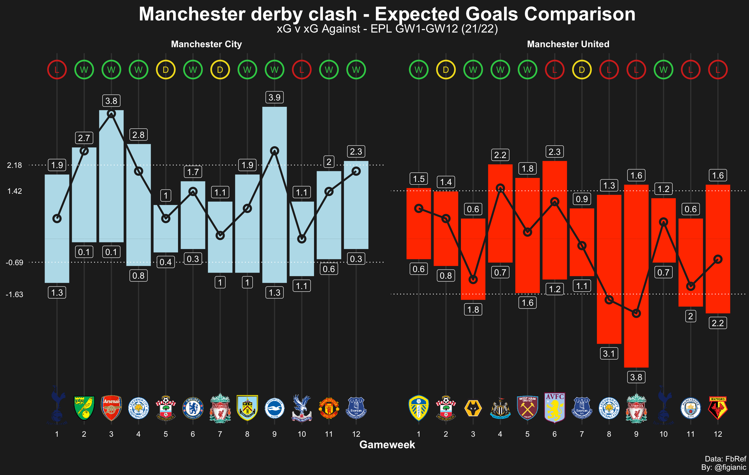
The script I created, can be used to compare multiple xG plus/minus at the same time. Below, there's a comparison between Manchester city rivals which is incredibly interesting.

We already mentioned the positive xG-xGA difference for City. On the other hand, Manchester United registered an xGA > xG on six occasions and they won only one of these games (against Wolves in GW3).
Also, mean values are very intriguing again: on average, Man City deserve to score 1 goal more than United (City xG is 2.18 against United's 1.42). On top of that, on average, United registered an xG against which is 0.94 lower than City. At this point, it's no surprise that the citizens beat the city rivals 2-0.
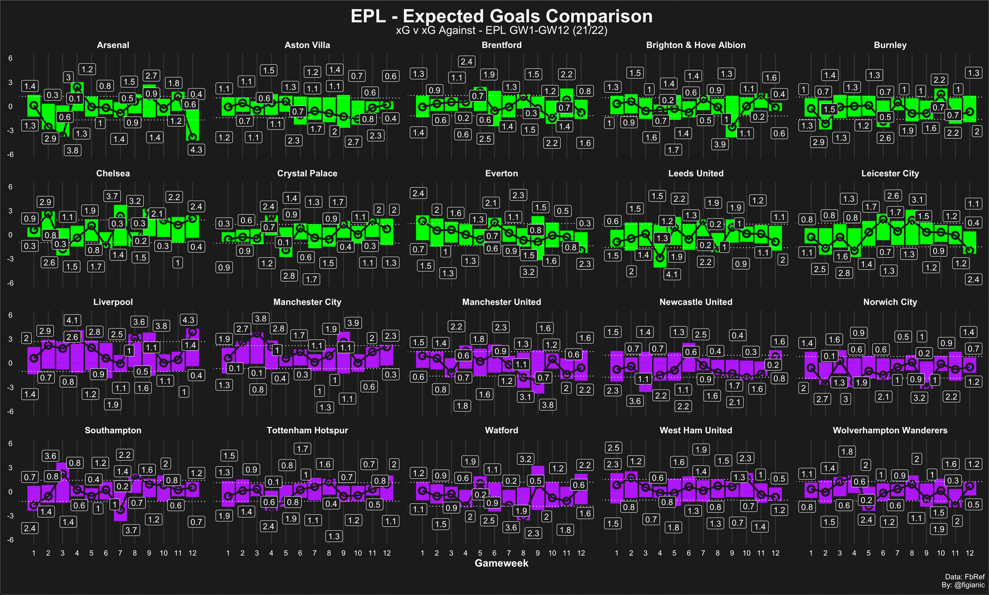
I also dared to create "da beast"! Where you can appreciate the xG-xGA for each EPL team at once. I had to get rid of a few stuff to improve the visibility but here it is:
Full code and usage
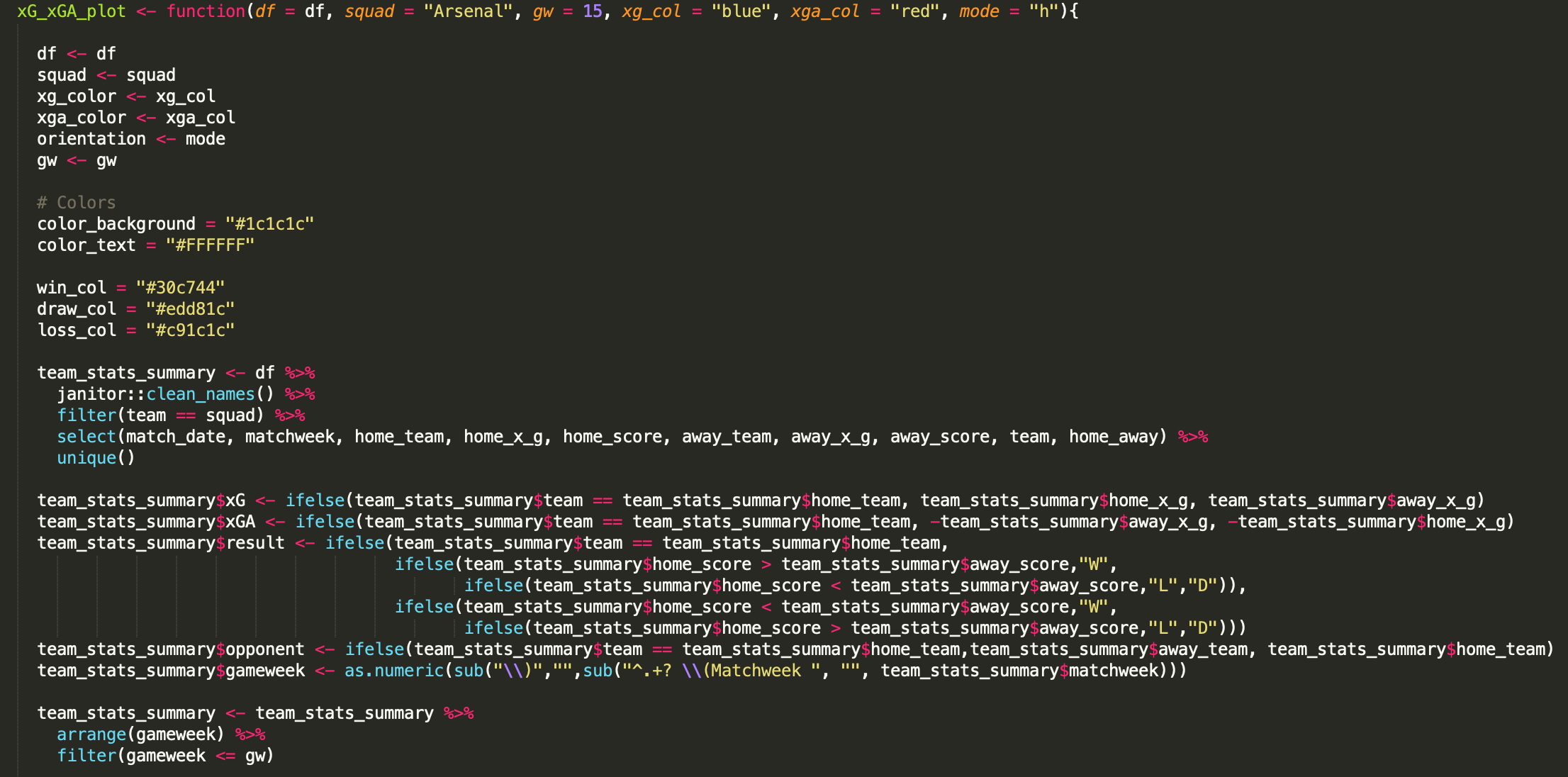
I embedded all the relevant code in a single function, named xG_xGA_plot, that you can use to create xG-xGA comparison charts very easily.
Here is the full code:
At this point, remember to add the link for the team logos like:
I haven't included the entire code because it would have been too long but you've got the point.
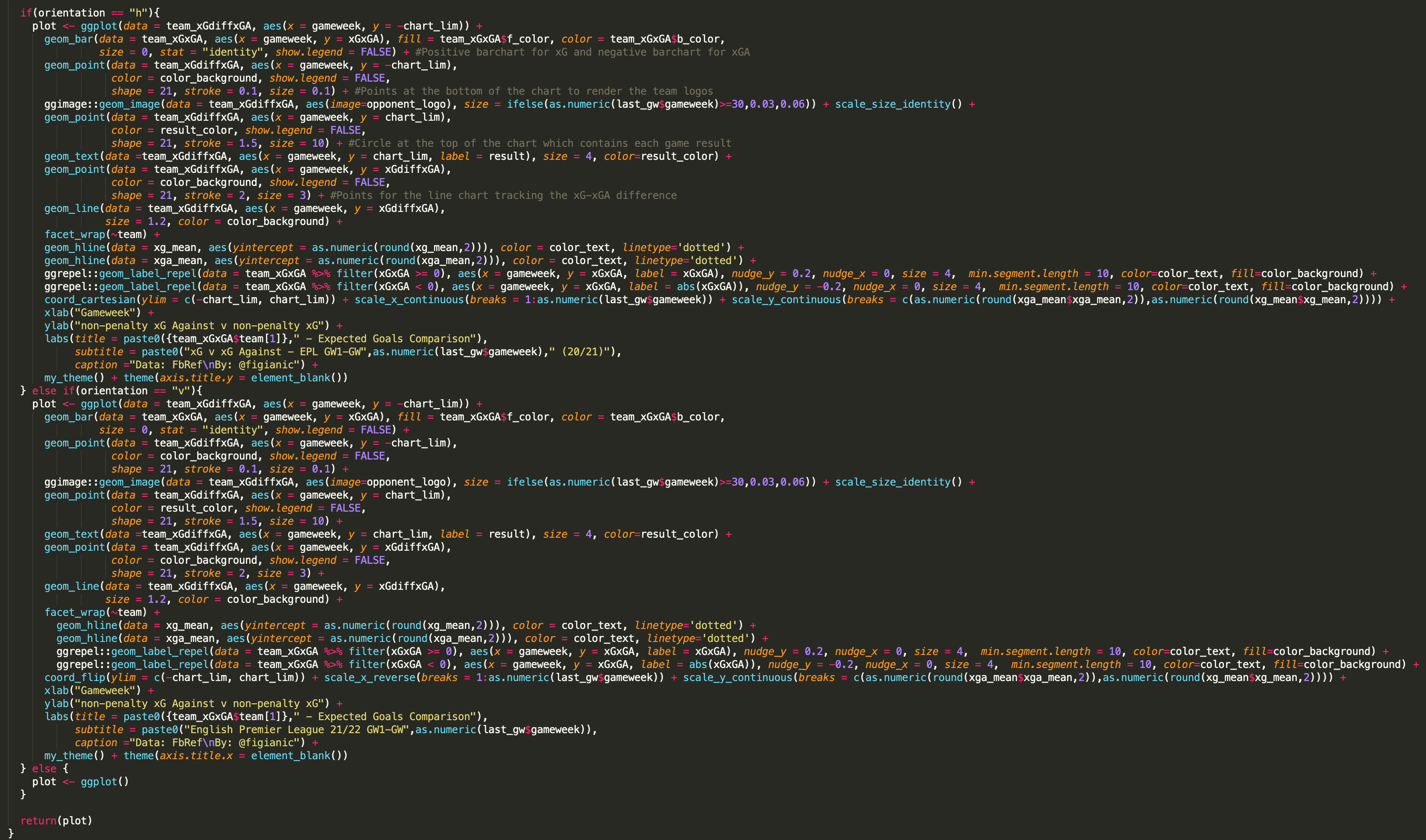
Once the xG_xGA_plot function is implemented, you just need a few lines of code to generate the chart for a specific team. All the parameters are pretty self-explanatory. You can also create the "vertical" version of the graph by specifying mode="v", like in the Chelsea example above.
In the example below, I plotted the xG-xGA comparison for Manchester City and saved the plot as a PNG image:
#Load libraries
library(worldfootballR)
library(tidyverse)

#Retrieve EPL 2021/2022 events
epl_22_urls <- get_match_urls(country = "ENG", gender = "M", season_end_year = 2022, tier = "1st")
epl_22_stats <- get_match_summary(match_url=epl_22_urls)

#Create and save the plot for Man City
epl2122_ManCity_xGxGA <- xG_xGA_plot(df = epl_22_stats, squad = "Manchester City", gw = 12, xg_col = "lightblue", xga_col = "white", mode="h")

#Save the plot as a PNG image
ggsave("epl2122_ManCity_xGxGA.png",  epl2122_ManCity_xGxGA, w = 11, h = 11, dpi = 300)
Conclusion
Ok, this was a long one but I hope you found it interesting. There are so many variations that you can try, and other things to implement like adding a bar with the number of goals conceded and scored for each game week.
Hopefully, next time you want to plot an xG-xGA comparison you will know how to do it. I'm planning to create a package with the code above and put it on Github so that everything is already done for you. More on that hopefully soon.
As usual, let me know your thoughts and what you would like to see next. All sort of feedback is very welcome.
If you've appreciated this tutorial, consider subscribing to my newsletter. Follow me on Twitter (@figianic), share/retweet my work, and reach out if you need any help.