Football Analytics: Creating a performance timeline in R
In this tutorial, I'm going to show you how to create a bump chart to represent the progression of Expected Points (xP) collected by Serie A teams over time.

I've been finding it more and more interesting to create timeline charts to represent the evolution of a specific variable related to sports performance. It could be the progression of the teams in the league table, how the top scorer leaderboard developed gameweek after gameweek, the accrued xG value of two teams during a game, and so on. Yes, a table may very well represent the same data to a certain extent, but a graphical representation is far more telling and captivating. It is also much fun to create one.
For this tutorial, I took inspiration from Dominik Koch's piece where he used ggplot to track the evolution of the medal table in the 2018 Olympic Winter Games in Pyeongchang https://dominikkoch.github.io/Bump-Chart/.
I brought the same logic to the world of football analytics to track Serie A teams' performance over time. In particular, I'm going to show you how to create a bump chart to represent the progression of Expected Points (xP) collected by each Serie A team over time.
Data structure
We start from a CSV file containing the xP figure for each team for every gameweek. Below you can find an excerpt of the data I'm currently using:
Gameweek,Squad,xP
1,Hellas,1.82
1,Inter,1.80
1,Torino,1.61
1,Empoli,1.32
1,Bologna,1.33
1,Udinese,2.50
1,Napoli,2.69
1,Roma,2.53
1,Cagliari,2.63
1,Sampdoria,1.43
1,Sassuolo,0.93
1,Genoa,0.90
1,Atalanta,1.06
1,Lazio,1.37
1,Salernitana,1.35
1,Juventus,0.35
1,Venezia,0.20
1,Fiorentina,0.33
1,Spezia,0.25
1,Milan,1.24
2,Udinese,2.55
2,Hellas,0.65
...
...
...
8,Torino,0.47
8,Roma,1.91
8,Fiorentina,0.59
I've been building the above file manually by appending the xP measure of each game/team after each gameweek.
To compute the xP, I start from the xG figure for each Serie A match, available on FBref, and then I obtain the xP for the two teams thanks to Danny Page's expected goals simulator https://danny.page/expected_goals.html.
Data manipulation
As usual, we need to import our CSV by using the read_csv function and load it into a data frame (DF). You will obtain a DF similar to the one below:
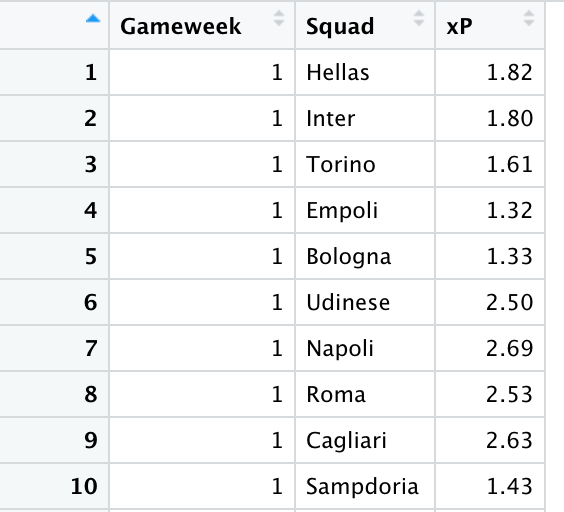
For each of the eight gameweeks, there is a xP value for each team, so the DF should contain 160 entries in total.
Then, we need to compute a cumulative sum on the expected points value for each team, gameweek by gameweek. It required some time to find the right way to achieve this, but the following eventually did the job:
# Calculate cumulative sum
d_xp$csum <- ave(d_xp$xP, d_xp$Squad, FUN=cumsum)
The above will create a new column containing the cumulative sum, that is the sum of the xP for each team, gameweek by gameweek. For the first gameweek, this value will be the same as the xP. Then, for each squad, the csum measure of the second gameweek will contain the sum of xP of the first and second game. At gameweek eight, the cumulative sum will contain the total of the xP measure of all the previous games from one to eight.
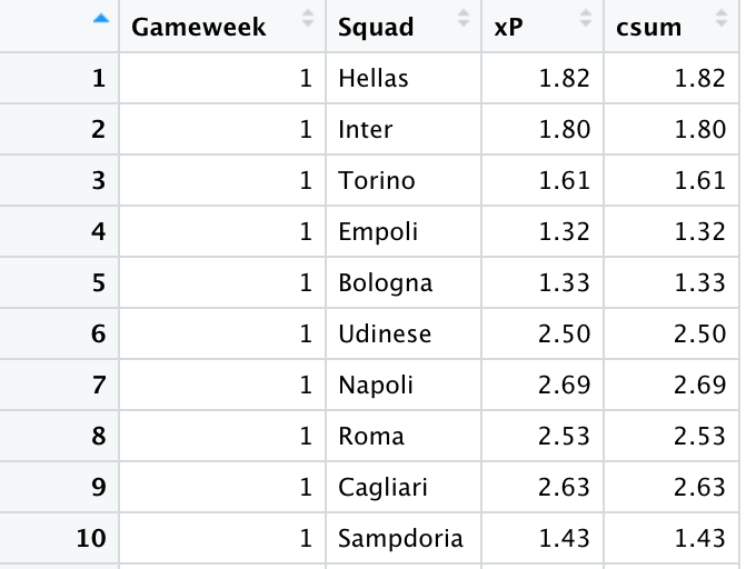
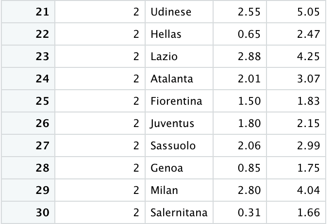
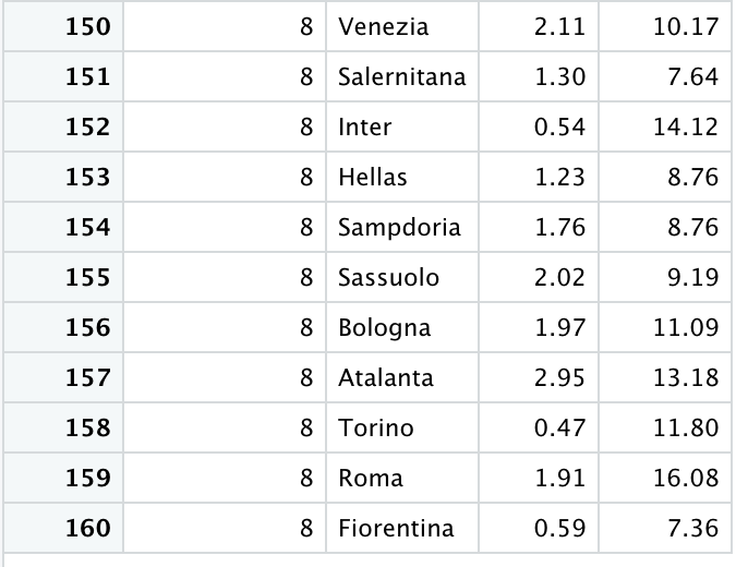
Let's consider Hellas Verona as an example. They scored a total of 1.82 xP when they lost to Sassuolo in the campaign opener. In the second game, a 3-1 defeat against Inter Milan, they collected only 0.65 xP. The cumulative sum, considering GW1 and GW2, is 1.82+0.65=2.47. And so on until the very last gameweek so far, gameweek eight, where their total cumulative sum of xP is 8.76.
To rank the teams from one to twenty for each gameweek, we need a sorting mechanism to order the squads. In particular, for a given gameweek, we rank the teams based on their cumulative xP figure, then by the xP measure of that single gameweek. At last, teams are ranked in alphabetical order in case of a tie.
# Add the csum column and evaluate a ranking on it for each team on each GW
d_xp_rank <- d_xp %>%
  group_by(Gameweek) %>%
  arrange(Gameweek, desc(csum), desc(xP), Squad) %>%
  mutate(ranking = row_number()) %>%
  as.data.frame()
A new column named ranking is created to sort the teams from one to twenty based on the cumulative performance for each gameweek. This value is reset at each new gameweek.
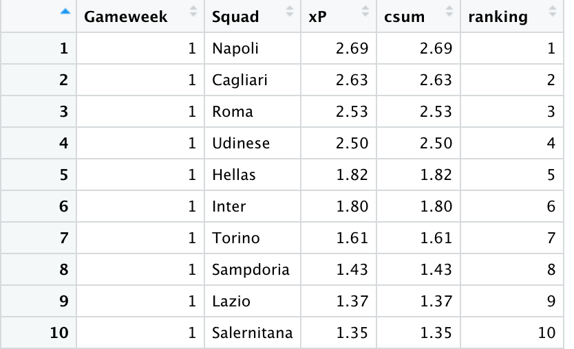
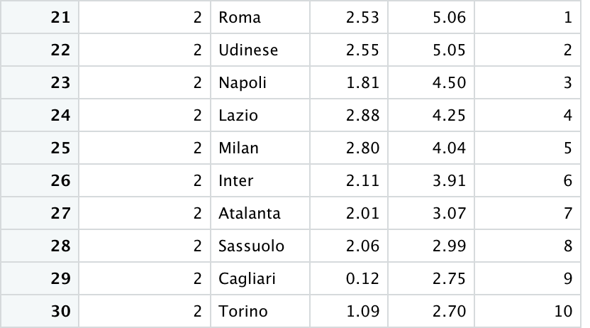
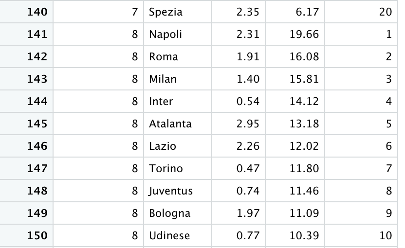
Let's consider the DF above. Napoli are the top performer in gameweek one, so they are ranked first, Cagliari collected the second-highest xP, so they are second, and so on. A new 1-20 ranking is then evaluated for gameweek two. This time, the cumulative sum is taken into account. Despite Lazio having the highest xP for gameweek two, Roma show the highest cumulative xP across the first two games so they are ranked as first ahead of Udinese and Napoli. This logic is taken into account to order the team from one to twenty for each gameweek.
Coming up with a meaningful data structure to correctly implement the bump chart is the trickiest bit. If you've made it so far, now it's just a matter of visualising the data.
Chart visualisation
ggplot will allow you to plot the bump chart easily. No other functions or external libraries are strictly required. However, even if it's not necessarily needed, I've decided to use the ggbump package in addition to ggplot for a "bumpier" style.
ggplot(data = d_xp_rank, aes(x = Gameweek, y = ranking, color = Squad)) +
  geom_bump(size = 1.5)
From the above, we can identify:
- d_xp_rank: is the data frame containing the data structure we created as detailed above
- Gameweek: is the column name containing the time unit that we want to plot on the x-axis. We will have a data point with the xP figure for each gameweek
- ranking: is the field containing the 1-20 rank for each gameweek to plot on the y axis
- Squad: is the field containing the name of the teams. We assign a different colour to each one of them.
By running the above R commands, we get the following preliminary bump chart:
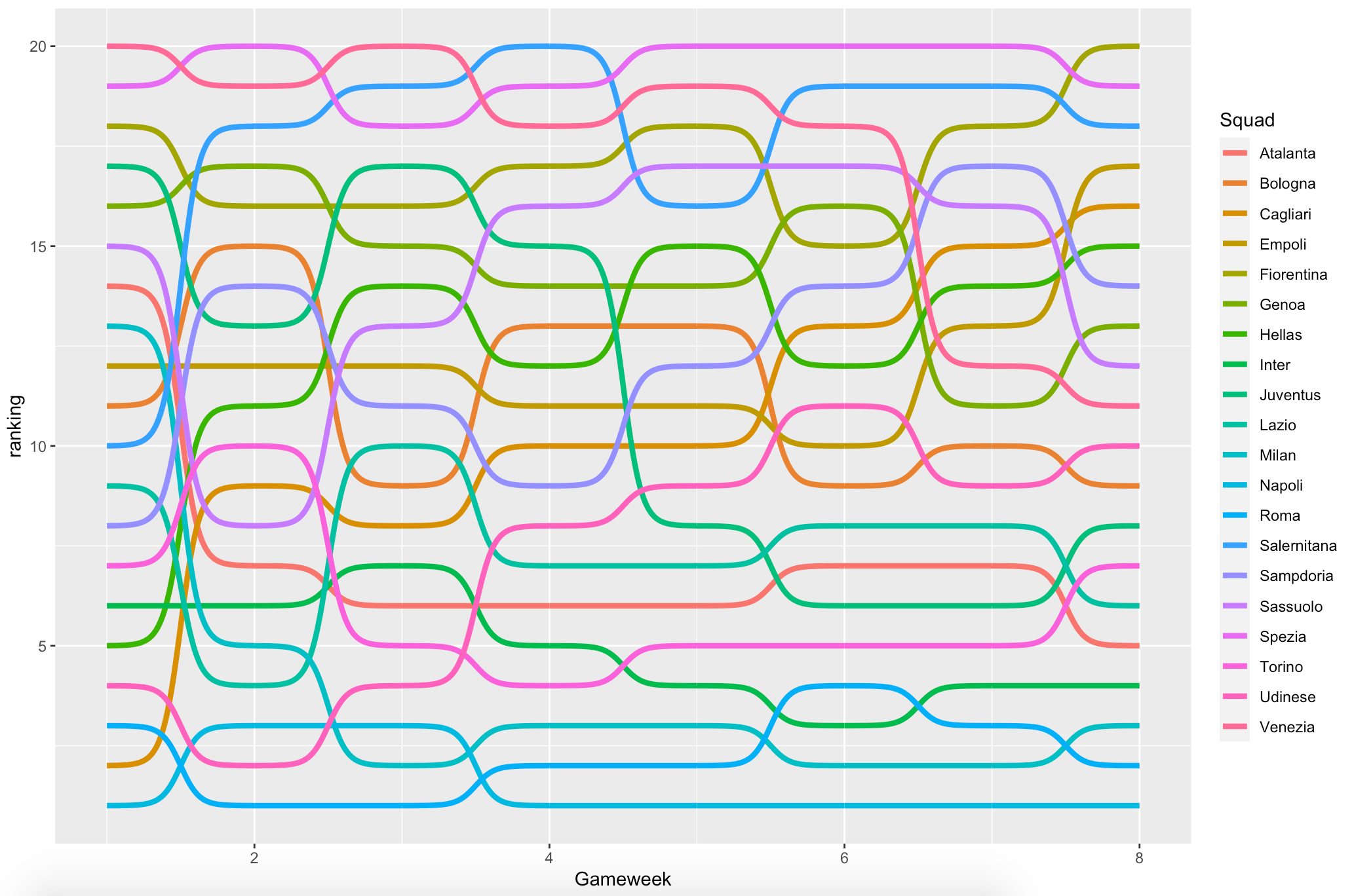
It's a decent start, but it is difficult to understand what's going on here. What teams are the top performers? It's very unclear.
Let's add data points for each measurement and flip the y-scale so that the top performers are on top:
geom_point(aes(color = Squad, alpha = 1), size = 4) +
geom_point(color = "#FFFFFF", size = 1) +
scale_y_reverse(breaks = 1:show_top_n)
The commands above will make the chart a bit more clear.
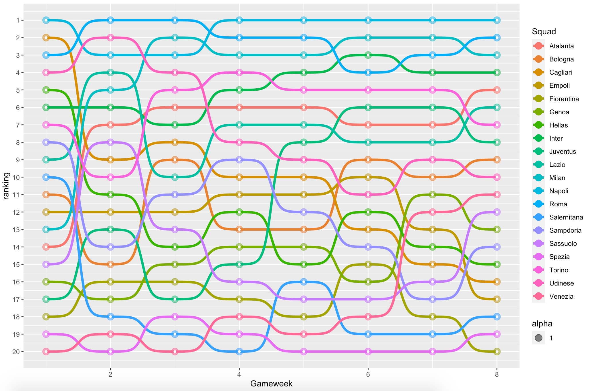
Much better now. It's visually easier to understand the team ranking for each gameweek, and the top performers are on top as you would expect in a leaderboard.
We can make team names more explicit by adding labels and making the plot even more straightforward:
geom_text(data = d_xp_rank %>% filter(Gameweek == "1"),
            aes(label = Squad, x = 0.5) , hjust = .5, fontface = "bold", color = "#888888", size = 4) +
  geom_text(data = d_xp_rank %>% filter(Gameweek == num_of_gameweeks),
            aes(label = Squad, x = 8.5) , hjust = .5, fontface = "bold", color = "#888888", size = 4)
And we can also get rid of the legend, which is eating up a lot of space:
theme(legend.position = "none")
The two tweaks above result in the following graph:
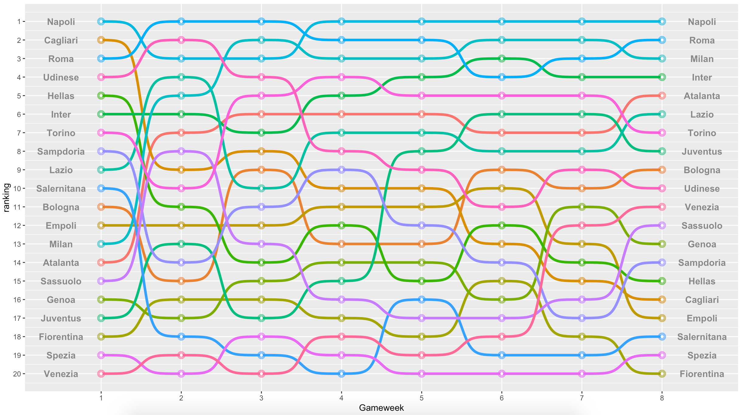
It's now simpler to follow each team's performance over time, gameweek by gameweek.
Now, some style is needed. Let's add a dark background, a few tweaks for better visualisation, a proper title and a subtitle. Close your eyes, re-run the plot, and here is the final result:
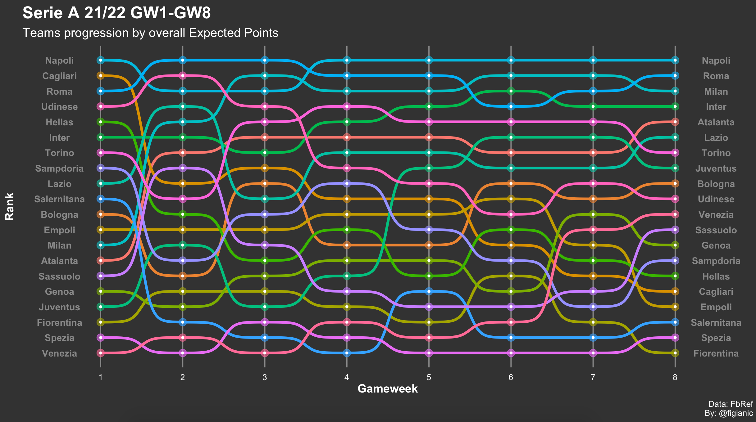
Ta-da! That's a great achievement. It is time to celebrate. You've just plotted the performance of Serie A teams over time. This is visualised in terms of Expected Points for the first eight gameweeks.
The diagram above unlocks various insights:
- It's quite obvious that Napoli have been the better side, and they lead the pack when looking exclusively at past performances
- Roma, Inter Milan and AC Milan have been very consistent, and they deserve a top-four spot
- Cagliari started very well in the first game but then dropped considerably
- Juve had a nightmare start, they are improving, but they are still lagging behind
- Torino under Juric are probably the surprise of this start of the season.
Additional insights
I like the final result where we can appreciate the evolution of all the teams in one single chart. Very often though, I want to create a similar diagram with only a subset of teams to understand how they are approaching their next game.
For instance, I created a similar bump chart considering only Juventus and Inter Milan's xP performance to better highlight how they were approaching the Derby D'Italia.
To create a similar diagram, I dynamically assigned a meaningful colour to the two teams, whereas all the other teams were greyed out.
d_xp_rank_zzz <- d_xp_rank %>%
  mutate(flag = ifelse(Squad %in% c("Juventus","Inter"), TRUE, FALSE),
         Squad_color = if_else(flag == TRUE, Squad, "zzz"))
If the team is either Inter Milan or Juventus, the flag is set to true and a specific colour is assigned accordingly. If the team is different from those two, the colour is "zzz" which will be translated into grey.
We need to adjust the ggplot to reflect the new scenario:
ggplot(data = d_xp_rank_zzz, aes(x = Gameweek, y = ranking, group = Squad, color = Squad_color)) +
...
...
...
scale_color_manual(values = squad_colours_array)
In particular:
- group = Squad to define the three groups mentioned above: team1 (Inter Milan), team2 (Juventus) and all the other teams that will be greyed out
- colour = Squad_color to map colours into the three categories
- In the last line, I manually assigned the colours for each category. Where squad_colours_array is defined as:
squad_colours_array = c("#041ca3","#ffffff","#888888")The three colours are applied in alphabetical order. The first parameter is a shade of blue for Inter Milan, the second is white for Juventus, and the third is grey for all the other teams we're not interested in.
Re-run the plot, and there you have it!
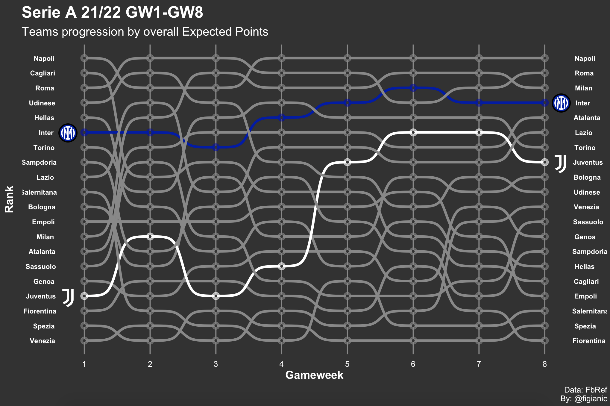
In the diagram above, I also added a nice final touch with GIMP to visualise team logos for the two teams. I love the final result where we can appreciate Inter Milan and Juventus' performance progression.
A few insightful considerations for the next game where they face each other:
- Inter Milan have been more consistent in terms of performance and they've been permanently in the top 5. They will very likely spend the most time on the ball, dictate possession and create more chances
- Juventus are still lacking consistency, and they're behind Inter Milan in terms of xG and xP. They will probably approach the game with a defensive-minded shape trying to score on the break.
Below you can see the full code:
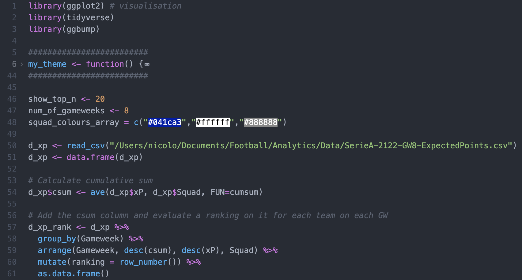
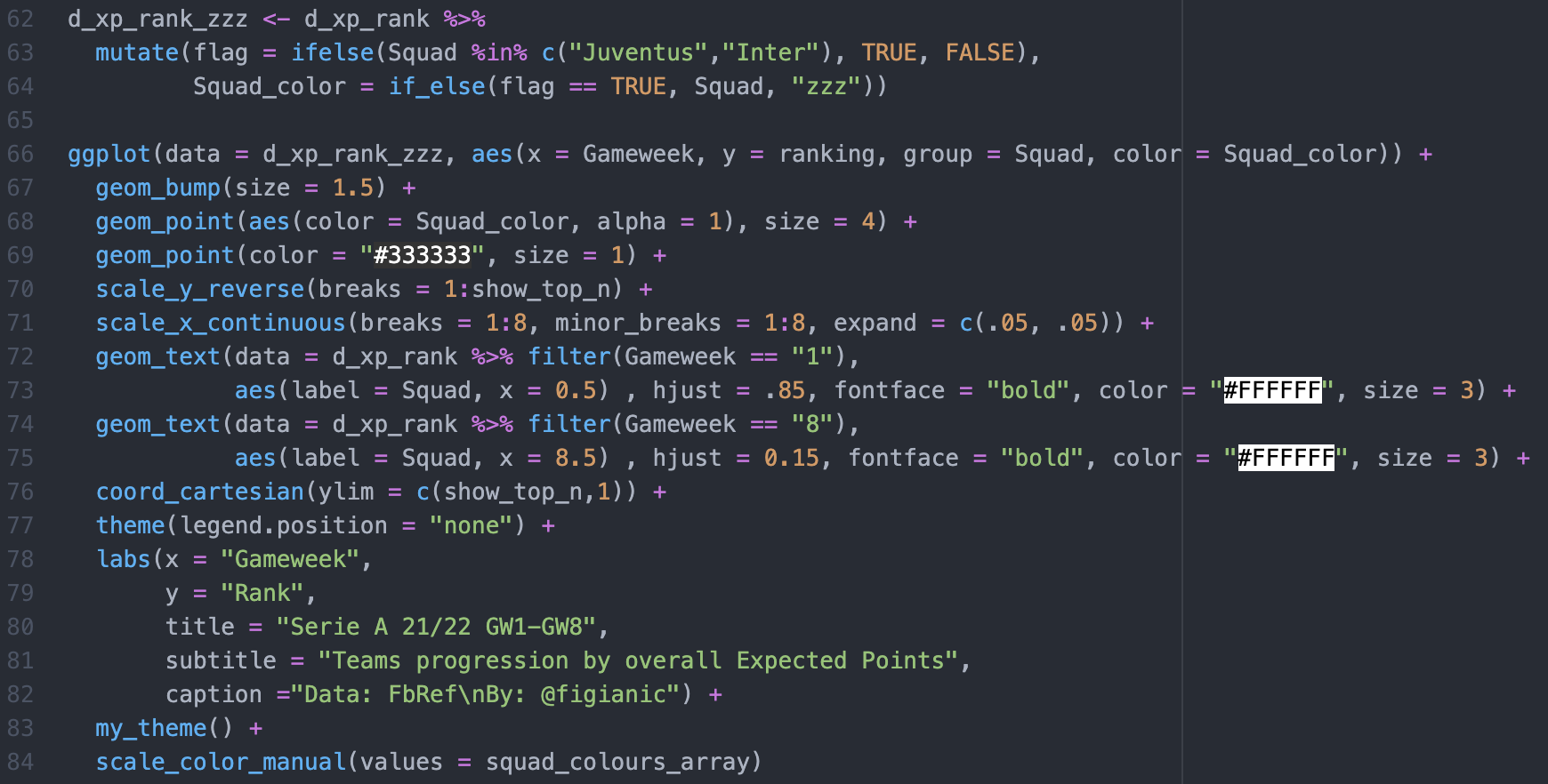
My custom theme is not very interesting at this point, but I can provide more details about it if needed.
I hope this was an interesting tutorial, and it piqued your interest. You can apply the same logic and create similar charts. For instance, you can plot the evolution of the top-four teams in the league to see who would get a Uefa Champions League spot, or you can highlight the bottom four to highlight who is more likely to get relegated based on performance and so on.
Let me know your thoughts and what you would like to see next.
If you've appreciated this tutorial, consider subscribing to my newsletter. Follow me on Twitter (@figianic), share/retweet my work, and reach out if you need any help.

