Football Analytics: Using R and FBref Data - Part 2
Building on the previous tutorial, this piece will focus on how we can make the scatter plot more appealing and provide additional insight.
Building on the previous tutorial, this piece will focus on how we can make the scatter plot more appealing and provide additional insight.
Straight-line annotations
For instance, we can add straight lines to see at first glance what teams are performing better than the average for the two variables we are considering, which are non-penalty Goals (npG) and non-penalty Expected Goals (npxG), respectively.
You can use the geom_hline in ggplot to create a horizontal line and set the yintercept parameter to the mean value of non-penalty goals, which can be easily computed using the mean function as follows:
geom_hline(yintercept = mean(shoot_data_team$npG), colour = "#fce53f")By also dding a bit of colour, the above produces the following:
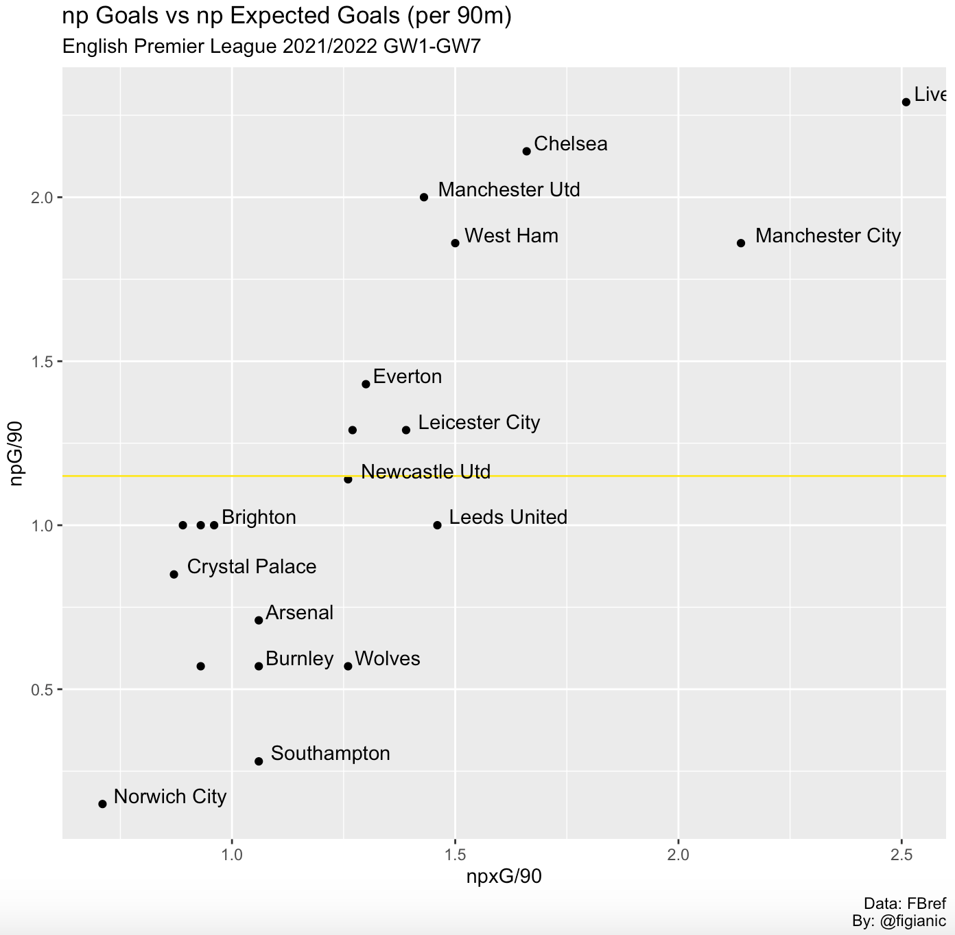
This way, we can easily see which teams are scoring more goals per game than the average. Similarly, the same approach can be applied to the other variable, npxG, to produce a vertical line:
geom_vline(xintercept = mean(shoot_data_team$npxG), colour = "#fce53f")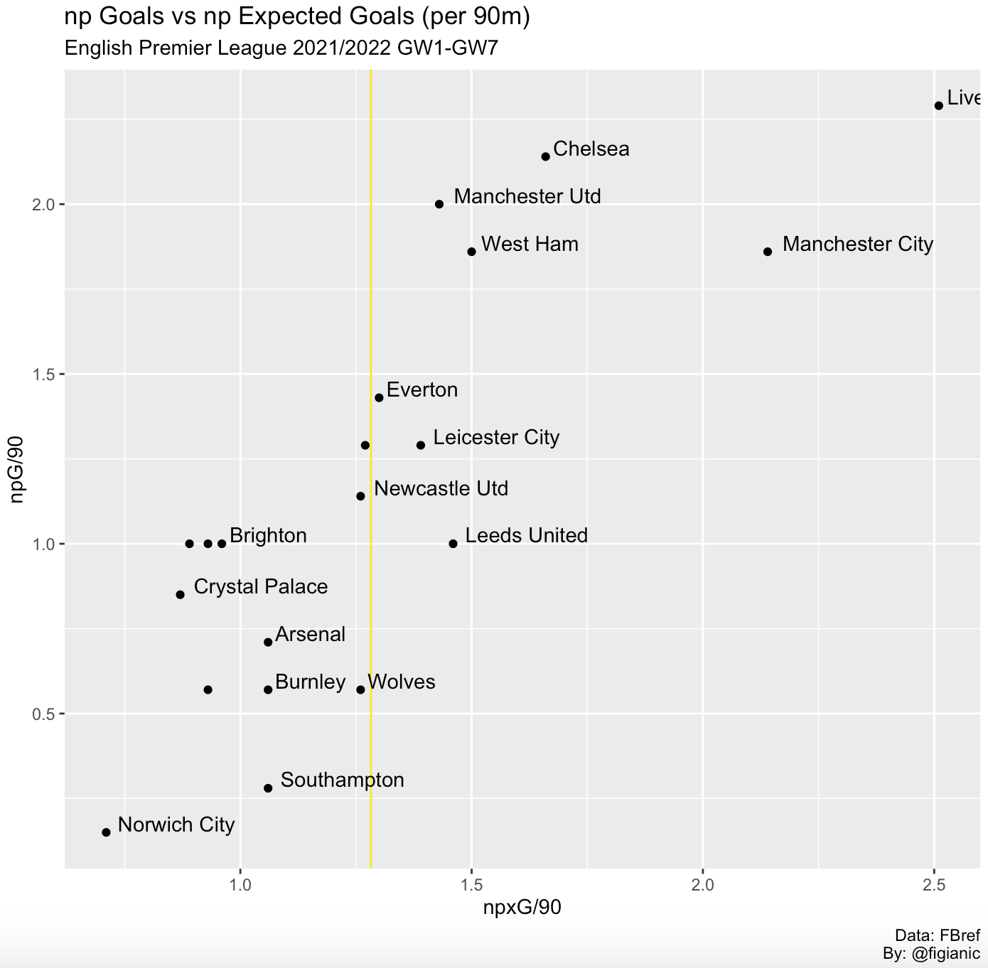
From the chart above, we can easily notice what squads show a non-penalty Expected Goals figure greater than the average.
Even more interesting would be to plot a diagonal line with slope=1 (y=x) to better highlight which teams have a npxG figure greater than their npG counterpart. It is very simple to achieve this in R thanks to the geom_abline function:
geom_abline(colour = "#fce53f")Aside from the custom line colour, no additional parameters are needed this time.
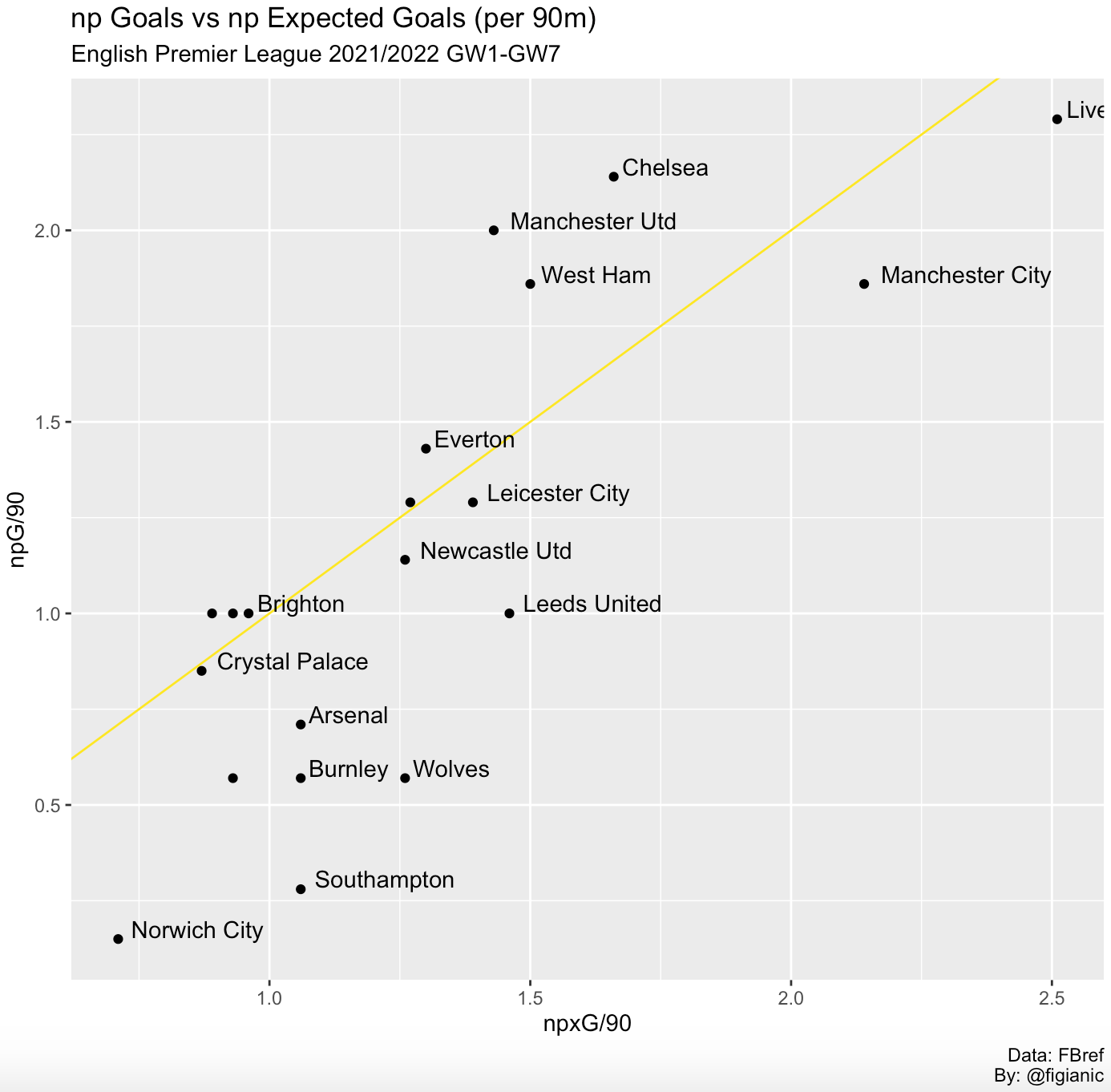
The trend line confirms something we had already noticed in the previous post but it's even more visually straightforward now.
Most of the teams are performing better than the actual results they are getting (npxG > npG), Liverpool have the highest npxG value, Manchester United are the most clinical team, Southampton is still struggling to convert chances, and so on.
Condition-coloured data points
Another interesting tweak would be to evaluate whether the npxG figure is greater than the goals scored for a team, and plot the data points with a certain colour, say green if this evaluates to true. On the other hand, we would select a different colour, say red, if the condition is false and npxG is lower than the goals scored for that squad.
The above translates into the following code where we select a different colour according to the ifelse condition, which is specified as a parameter of the ggplot function:
ggplot(shoot_data_team, aes(x=npxG, y=npG, color=ifelse(npxG > npG, "#5e9a78", "#ff4444"))) +
  scale_colour_manual(values = c("#5e9a78","#ff4444"), guide = "none") +
This helps us, even more, to visually identify which teams are performing better than the results they are achieving.
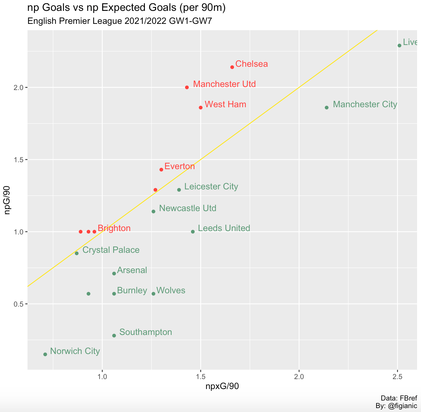
All the above options were just to show a few possibilities in terms of highlighting even more useful information. Picking more than one option might be redundant. You need to understand for each scenario which alternative provides more insights. However, I usually tend to prefer the diagonal trend line above everything else.
Custom style
At the moment, our plot still looks like it came out from a boring spreadsheet. Let's add some style and colour. You can customise every single aspect of the plot thanks to the theme function: background, text, font, axis, gridlines, you name it. For further reference, take a look at the theme function documentation to see all the components that you can customise.
To maintain the same-ish style of this blog, I came up with the following customisation:
theme(plot.background = element_rect(fill = "#333333"),
        plot.title = element_text(size = 25, colour = "white"),
        plot.subtitle = element_text(size = 15, colour = "white"),
        plot.caption = element_text(size = 10, colour = "white", hjust = 1),
        strip.background =element_rect(fill="#333333"),
        strip.text = element_text(colour = 'white'),
        axis.text.x = element_text(color = "white"),
        axis.text.y = element_text(color = "white"),
        axis.title.x = element_text(color = "white", face = "bold"),
        axis.title.y = element_text(color = "white", face = "bold"),
        axis.line = element_blank(),
        panel.grid.major.y = element_line(size = 0.5, colour = "grey"),
        panel.grid.minor.y = element_blank(),
        panel.grid.major.x = element_blank(),
        panel.grid.minor.x = element_blank(),
        panel.background = element_rect(fill = "#333333",
                                        colour = "#333333"),
        axis.ticks = element_line(colour = "white"))
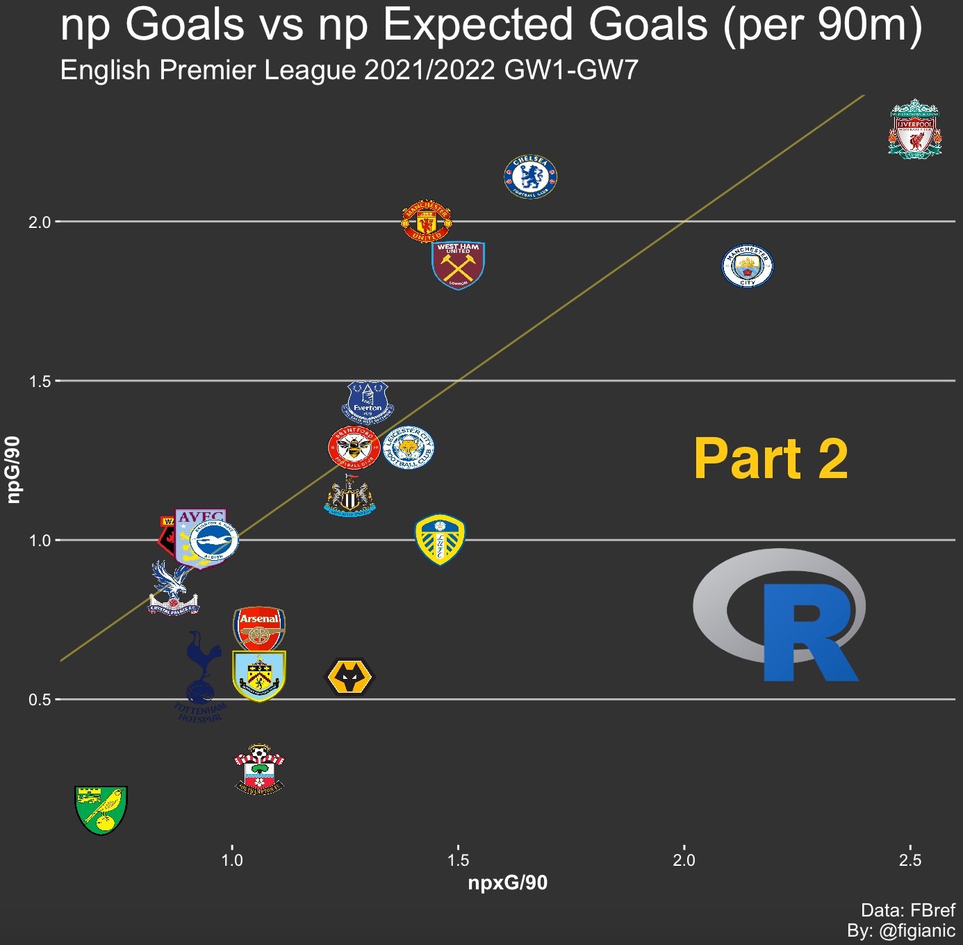
The above is pretty self-explanatory. I used a dark background, changed the text colour to white, and removed the grid lines on the x-axis just to make it more appealing. I decided to retain only the diagonal line and apply the above style.
This is how our plot looks like now:
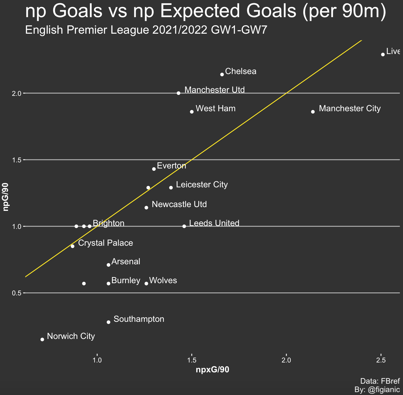
I like what we have now. You can further fine-tune the style components to suit your preference and this would usually be the final step to produce an easy on the eye, compelling scatter plot.
However, I decided to go one step further and do something even cooler. Wouldn't it be nice to have team logos instead of those bland white data points? Yes, it would, and here is how you can do it.
Image as a point in ggplot
As mentioned in this Stack Overflow post, there's a library called ggimage that we can use for this use case in conjunction with the rest of our code, and use images in ggplot.
Firstly, we need to install the "ggimage" library, which is easily done from the "Packages" section of RStudio.
Then, we just need to add a column to our Data Frame (DF) with the address of the image for each team. These can be found on the internet (http://...logo.png) or saved locally on your disk. In the latter case, you need to provide the full path (/Users/.../logo.png).
I found that all the logos are available with a transparent background on Wikipedia. So, I created a CSV file with two columns, Squad and Image, respectively, which looks like this:
Squad,Image
Arsenal,https://upload.wikimedia.org/wikipedia/en/5/53/Arsenal_FC.svg
Aston Villa,https://upload.wikimedia.org/wikipedia/en/f/f9/Aston_Villa_FC_crest_%282016%29.svg

...
...
...

West Ham,https://upload.wikimedia.org/wikipedia/en/c/c2/West_Ham_United_FC_logo.svg
Wolves,https://upload.wikimedia.org/wikipedia/en/f/fc/Wolverhampton_Wanderers.svg
Then, we just need to import the CSV file and load it into a DF:
d_images <- read_csv("/Users/nicolo/Documents/Football/Analytics/FbRef/PremierLeague_2122_images.csv")
epl_images <- data.frame(d_images)
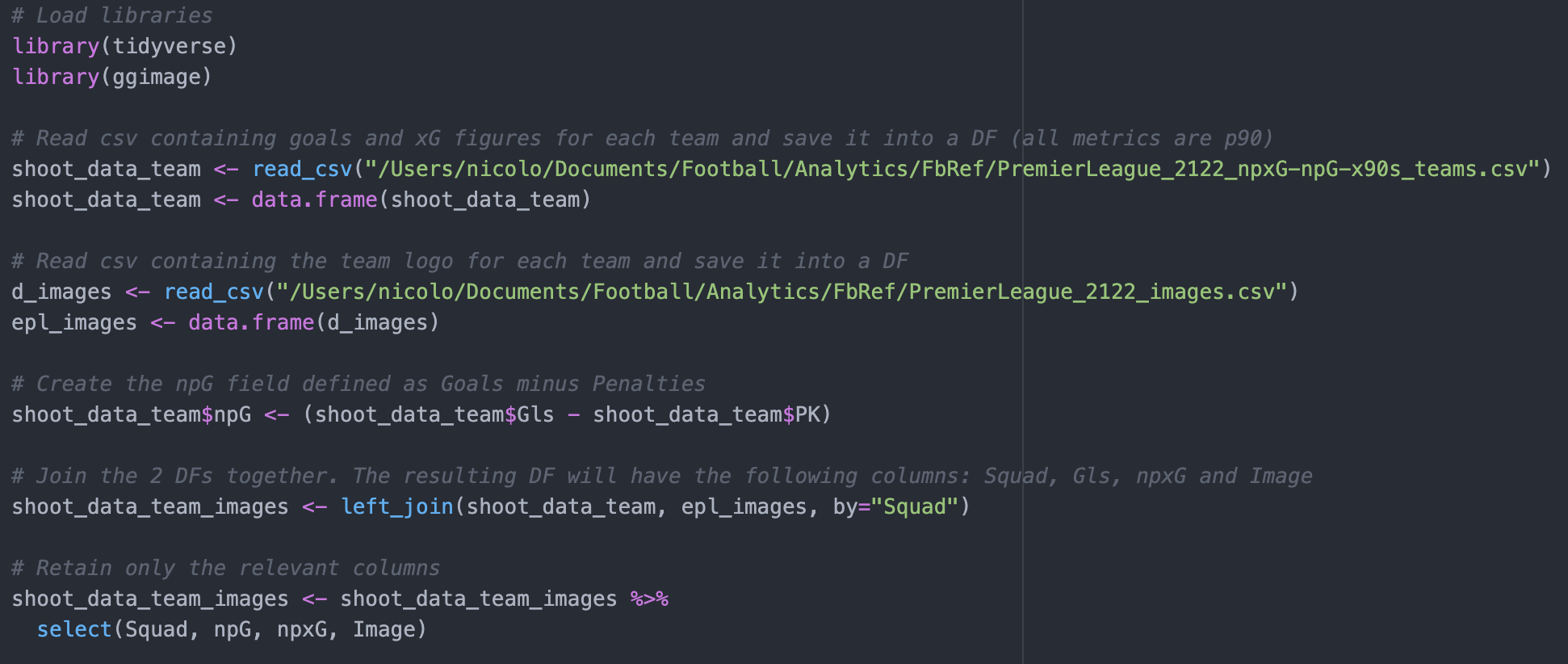
At this point, we still have two separate DFs: the one with npxG and npG figures that we used to plot the chart, and the other one, named epl_images, we just created with the location of team logos. We need to piece the two together to have a single DF with all the info we need, and the left join function is what we are going to use for this:
# Join the 2 DFs together. The resulting DF will have the following columns: Squad, npxG, npG and Image
shoot_data_team_images <- left_join(shoot_data_team, epl_images, by="Squad")
The command above will perform a left join between the two datasets where the Squad column is used as a key to merge the two.
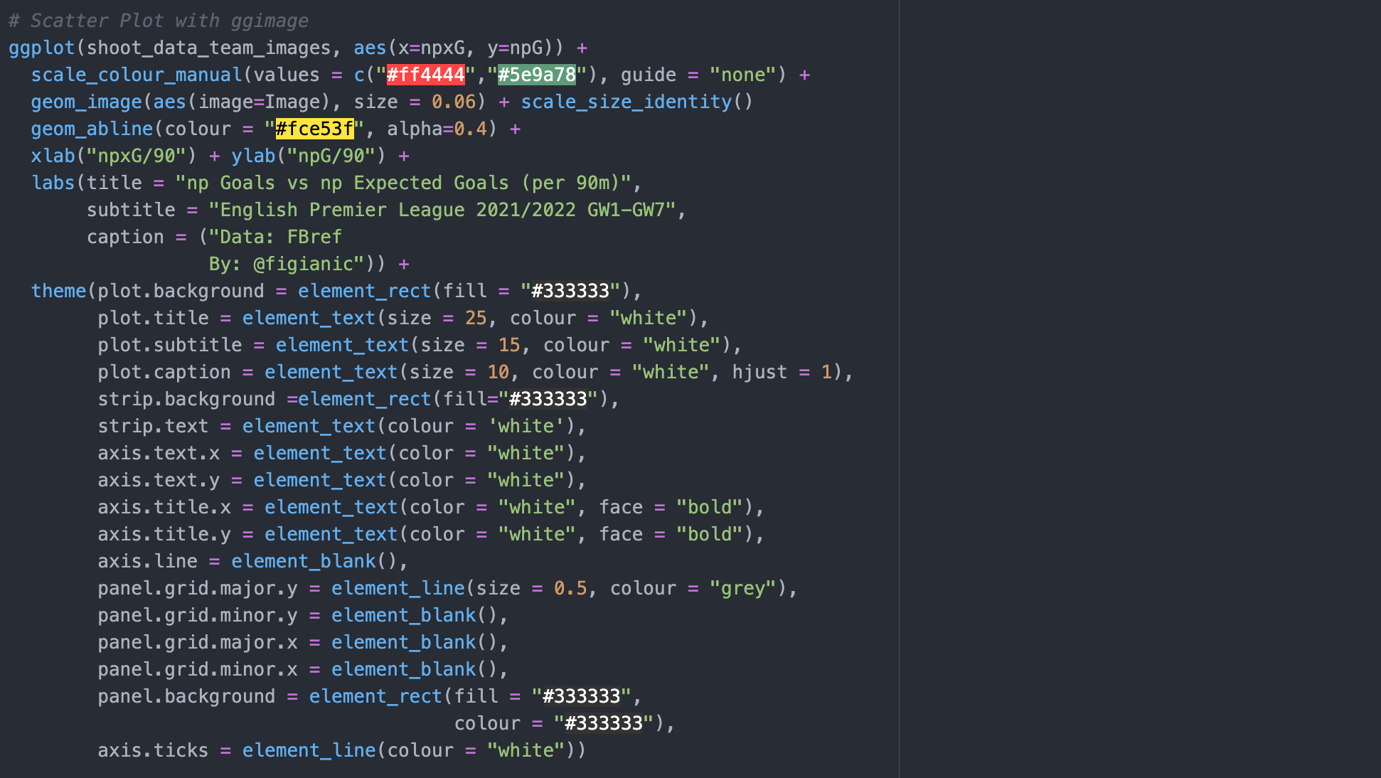
Now we just need to adjust our plot to show the logos for each team instead of the dots. Instead of geom_point, which you can remove, we will use the geom_image function as shown below:
#Image is the column in the data frame containing the link/path of the picture
geom_image(aes(image=Image), size = 0.06) + scale_size_identity()
Here you set the image parameter to the column containing the URL or path of the images, and in our case, the column is named Image. By playing around with the sizing I found out that 0.06 was a decent compromise, and scale_size_identity should help to maintain a better aspect ratio.
Below, you can see the full code:
Just run the plot one last time and ta-da!
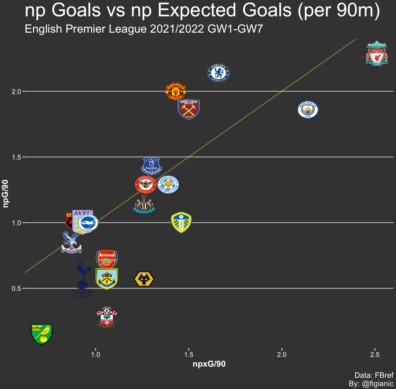
Pop some champagne open and go crazy! You've just created a neat scatter plot to compare np Expected Goals and np Goals for each English Premier League team, well done!
I hope you found this tutorial interesting. Again, feel free to tweak the code further, break things and fix them. This is what I'm doing too since I'm still learning.
Let me know your thoughts and what you would like to see next. I'm planning to write more pieces similar to this one to cover different use cases so stay tuned.
If you've appreciated this tutorial, follow me on Twitter (@figianic), share/retweet my work, and reach out if you need any help.

